


Keep motivation intact
Removing familiar rewards without breaking the habits members had already built.
Vitality is a behavior-change program offered through health plans and employers to millions of U.S. members. Members earn points for healthy activities. Points build status, from Bronze to Platinum, and higher status unlocks bigger rewards.
Points are the engine of the program. What earns points is what members pay attention to.
The old framework rewarded almost any interaction, including low-effort ones like reading an article or checking in on a goal. Engagement went up, but R&D’s outcome data revealed the gap: members with higher status weren’t necessarily getting healthier.
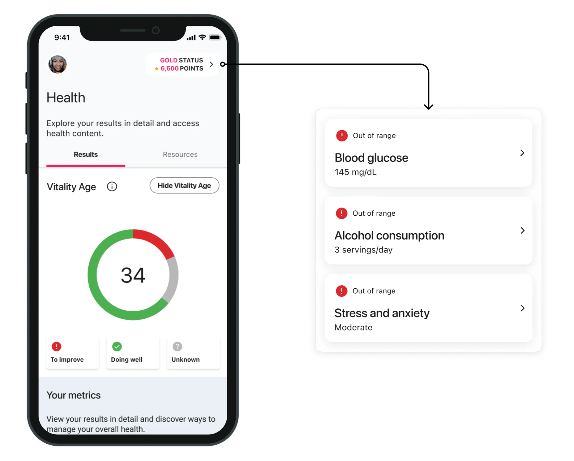
Shifting points toward high-impact activities meant taking points away from familiar ones. The design had to make that change feel fair and easy to understand.
Removing familiar rewards without breaking the habits members had already built.
Preventing confusion or frustration among members used to the old rules.
Maintaining consistency across mobile and web.
As the product designer, my focus was translating a new product-defined rewards framework into a clear and intuitive member experience. The challenge was making complex rules around points, status, and activities understandable while helping members recognize which actions contribute to their progress.
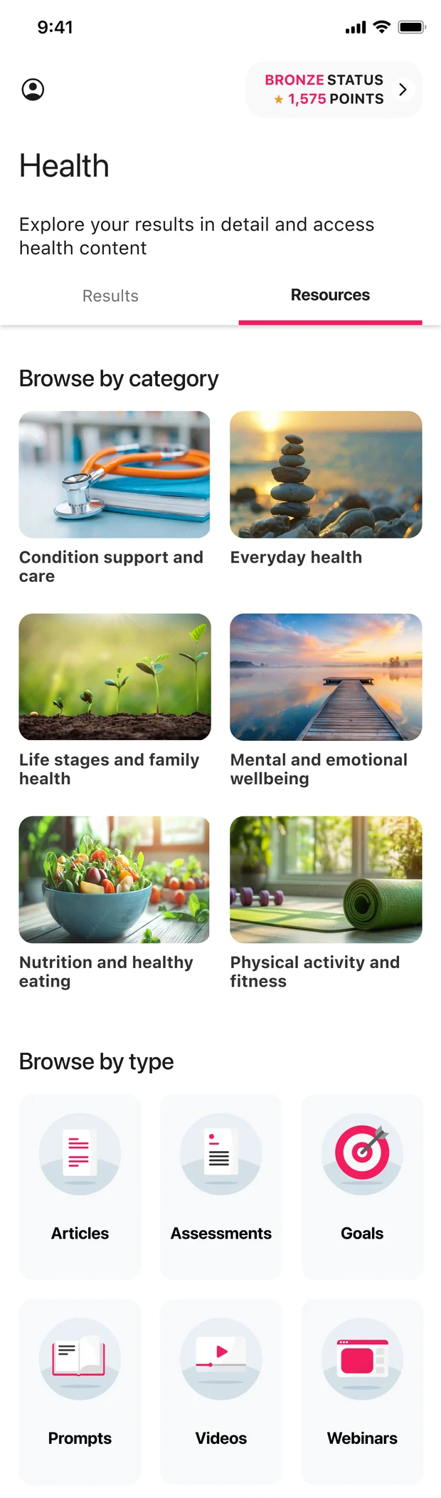
The new framework stopped awarding points for activities like articles, assessments, and journals, but they still supported members’ health. I helped connect the rewards experience to Resources in Health, making it their new destination, organized two ways that work together.
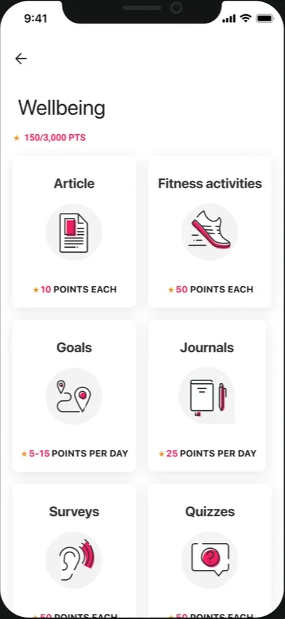
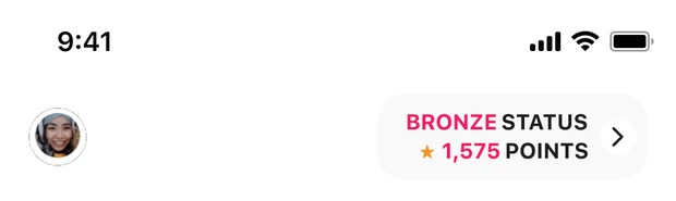

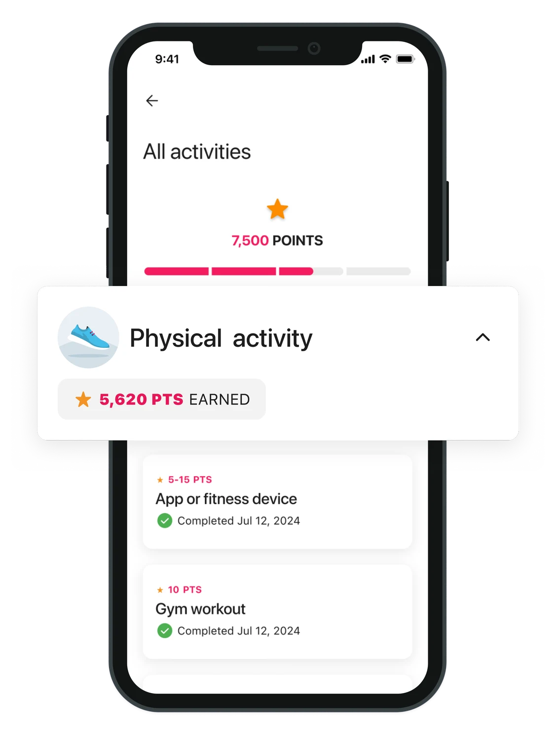
Under the new framework, workouts moved out of Wellbeing into their own category, and their daily maximum doubled. On home, the biggest source of points is now the first thing members see.
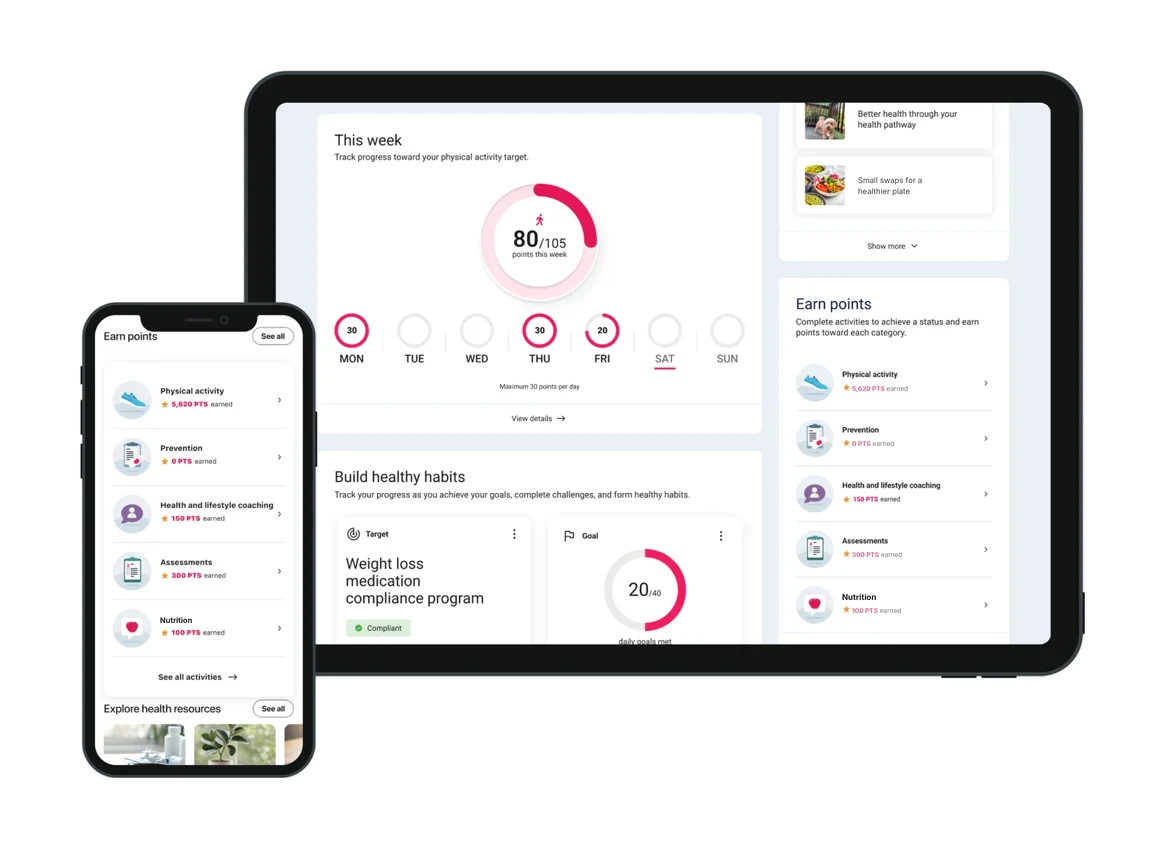
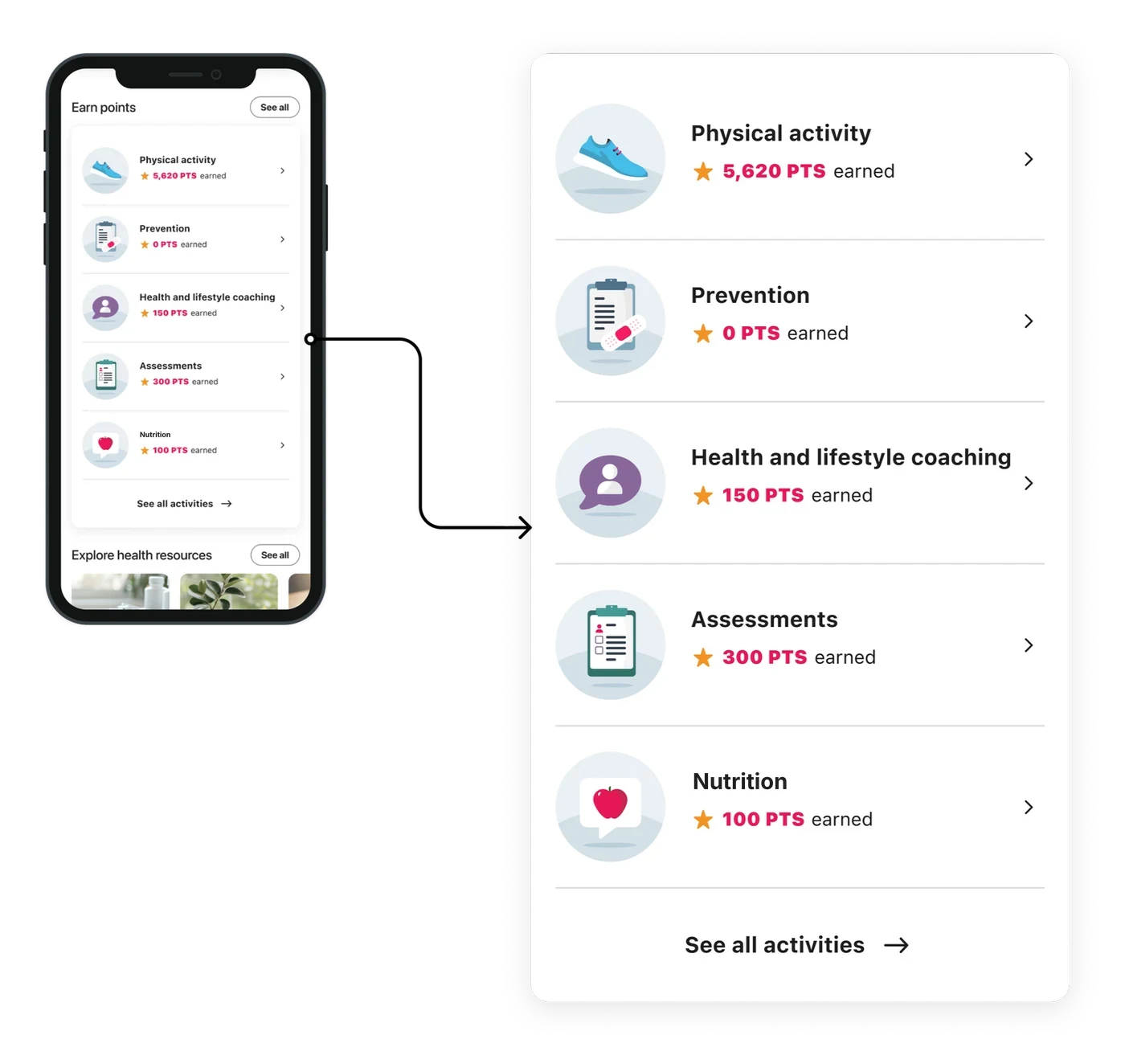
The framework grouped every activity into a category. On home, each category now shows the points a member has earned, so it’s clear where progress comes from.
I explored category progress bars to make earning points feel more motivating. But because point thresholds vary by client and can change mid-year, we chose to show points earned instead, keeping the experience accurate across configurations.


Progress toward a category max. Breaks when thresholds change.
Points earned only. Accurate for every client and program year.
I designed a four-step tutorial to introduce the updated rewards experience, helping members understand their status, new points categories, priorities, and rewards.
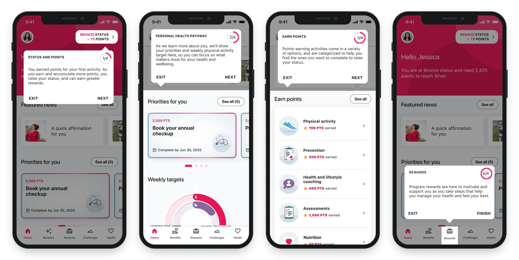
High-impact actions are front and center, grouped by category.
A clear split: earn points through actions, learn through Resources.
U.S. patterns now align with the global design system, so they’re easier to scale and maintain.
This redesign didn’t just clarify what members can do. It changed how they discover it, understand it, and stay engaged with it.