PAINTress Your Pain
The International Museum of Surgical Science App (Focused on an imaginary exhibit)
MY ROLE: Project Manager, UX Researcher, UI Designer | TOOLS: Figma, Adobe Photoshop, Adobe Illustrator | TIMELINE: 2 Weeks
Background
What is PAINTress Your Pain
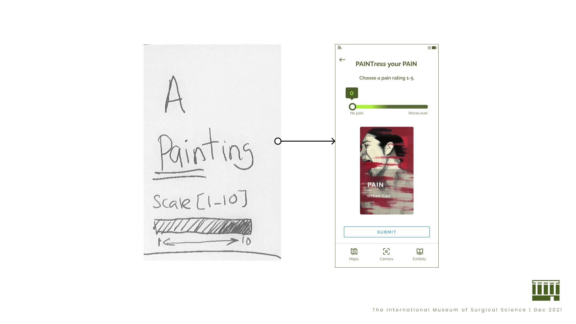
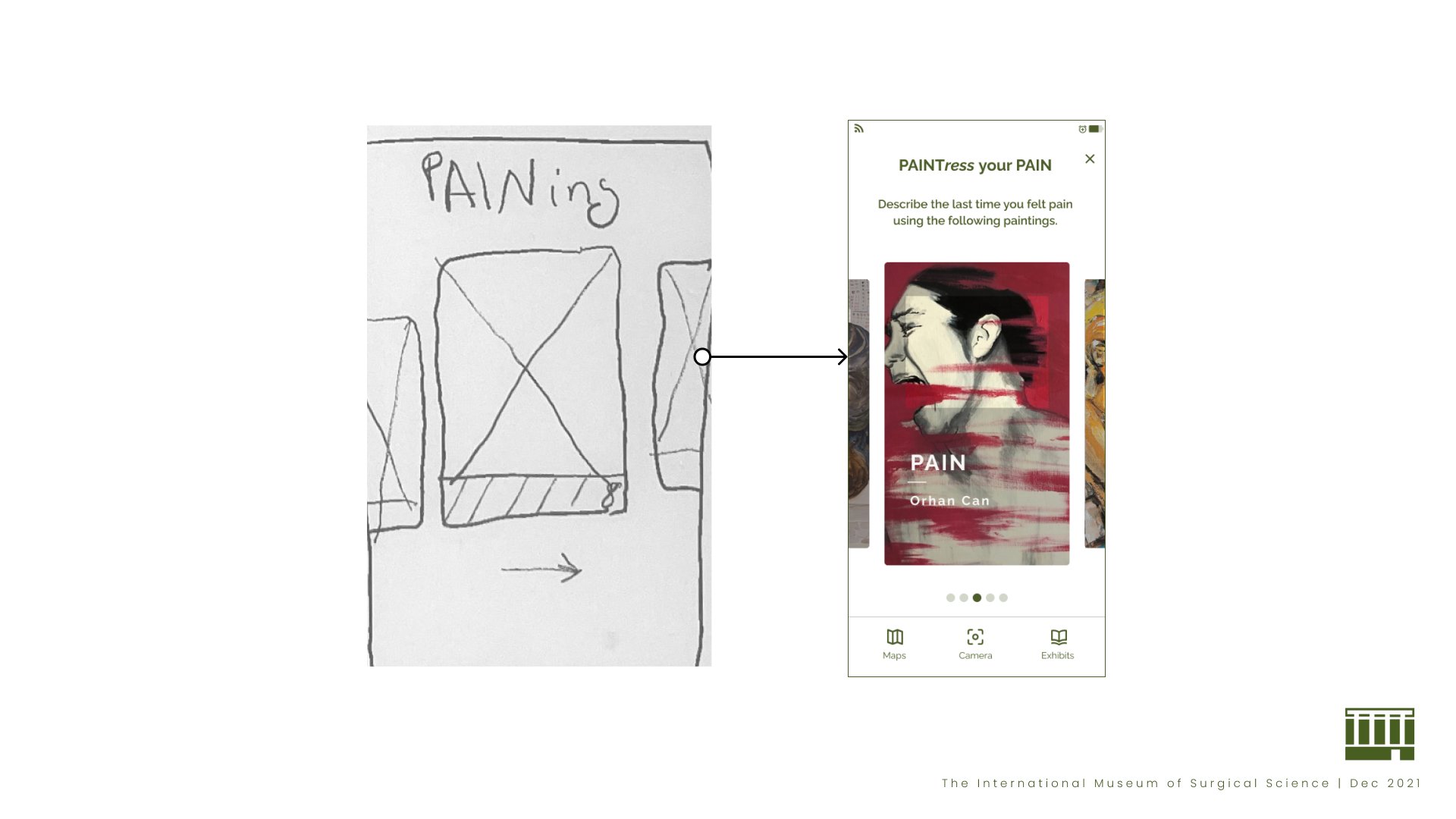
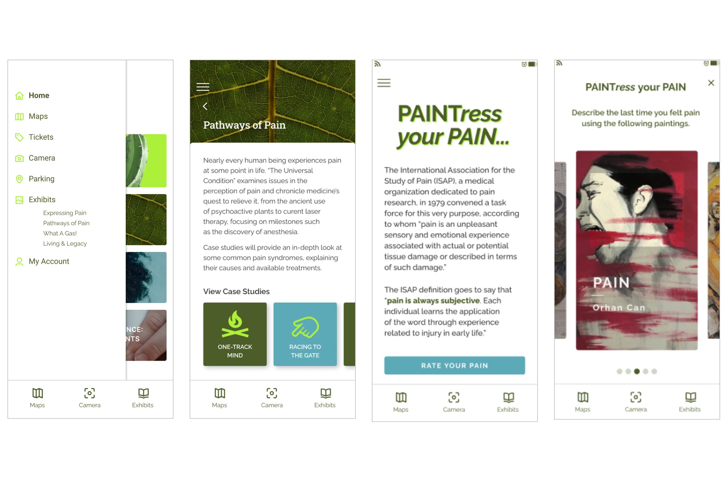
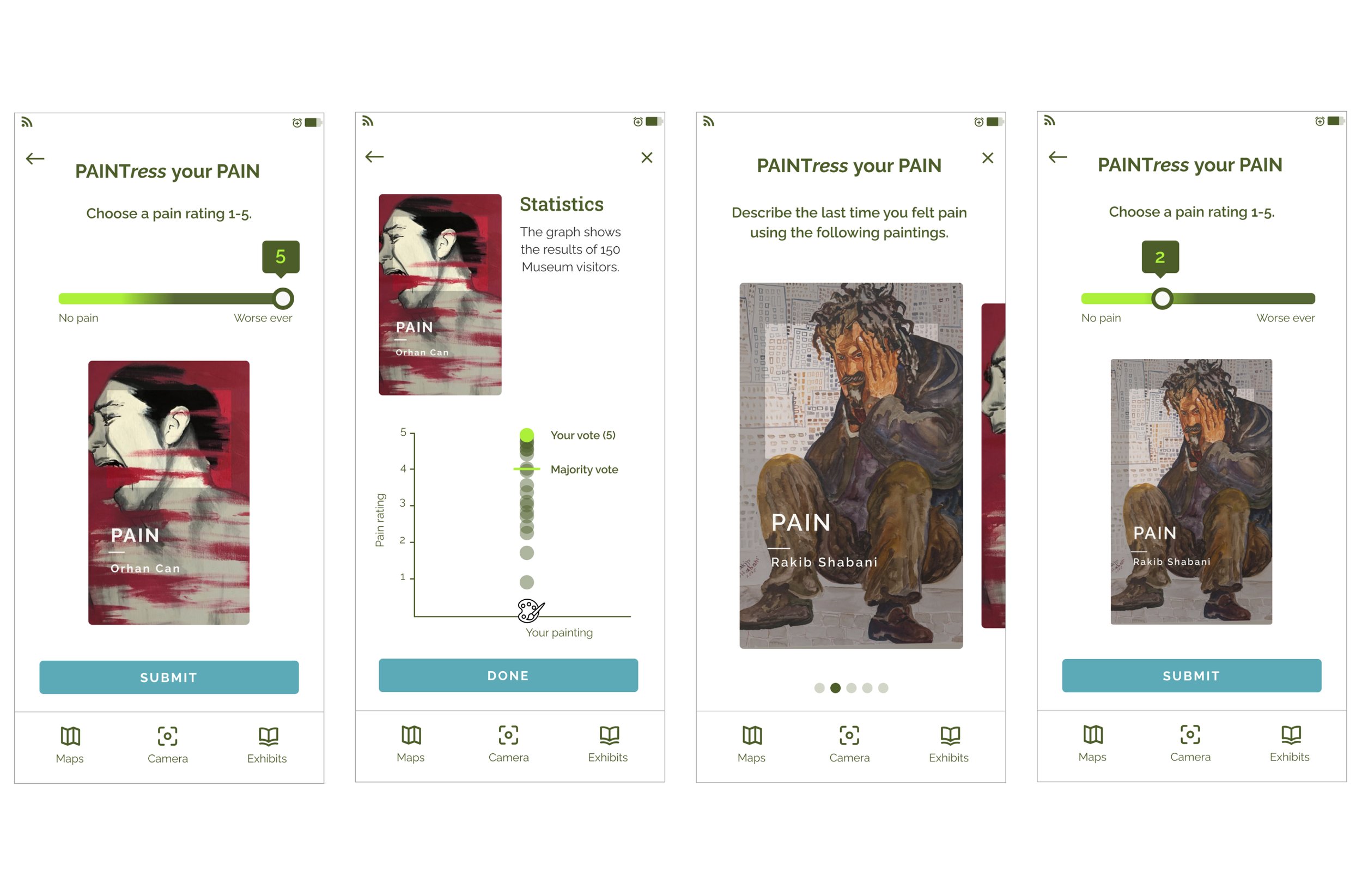
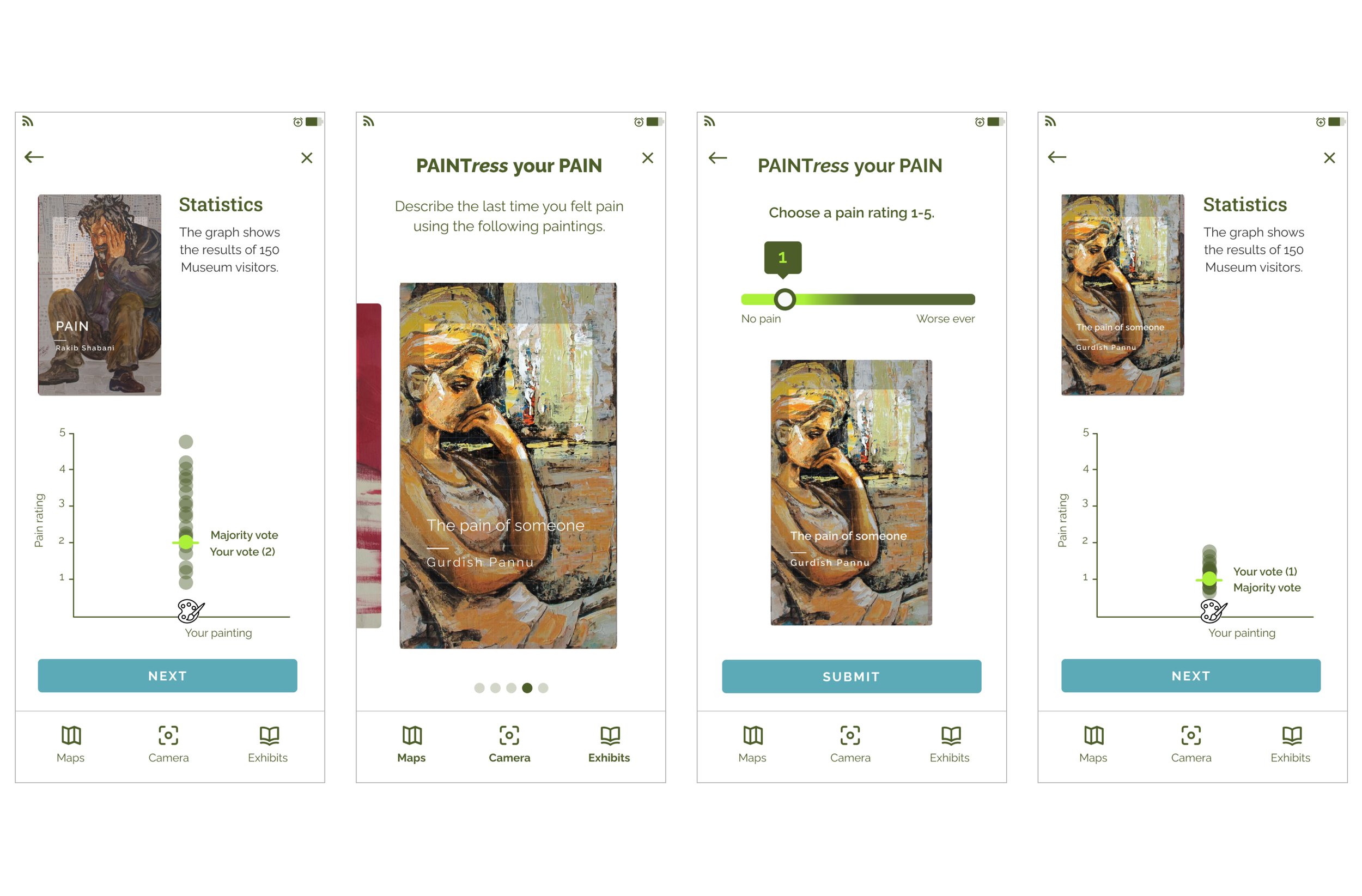
PAINTress Your Pain is an interactive experience that allows visitors to rate a recent pain experience on a scale of 1-5. They select a painting that reflects their level of pain, such as one that signifies a severity of 5. Visitors can then compare their ratings with others, fostering a shared narrative about the subjectivity of pain.
Problem Statement
The International Museum of Surgical Science needs an engaging and meaningful visual representation for their Pain and Pain Management exhibit that not only appeals to a general audience but also provides value in real-world applications, helping to bridge the communication gap around pain.
SURVEY INSIGHTS
109 Responses
“What is your favorite museum type?”
37% Art Museums | 33% History Museums
“Who do you usually go to the museum with?”
45% with Family | 34% with Friends
“Would you visit a museum virtually?”
38% NO | 36% YES
“How do you receive updates about local museums?”
52% Social Media
“Are you currently an active member at a museum?”
93% NO
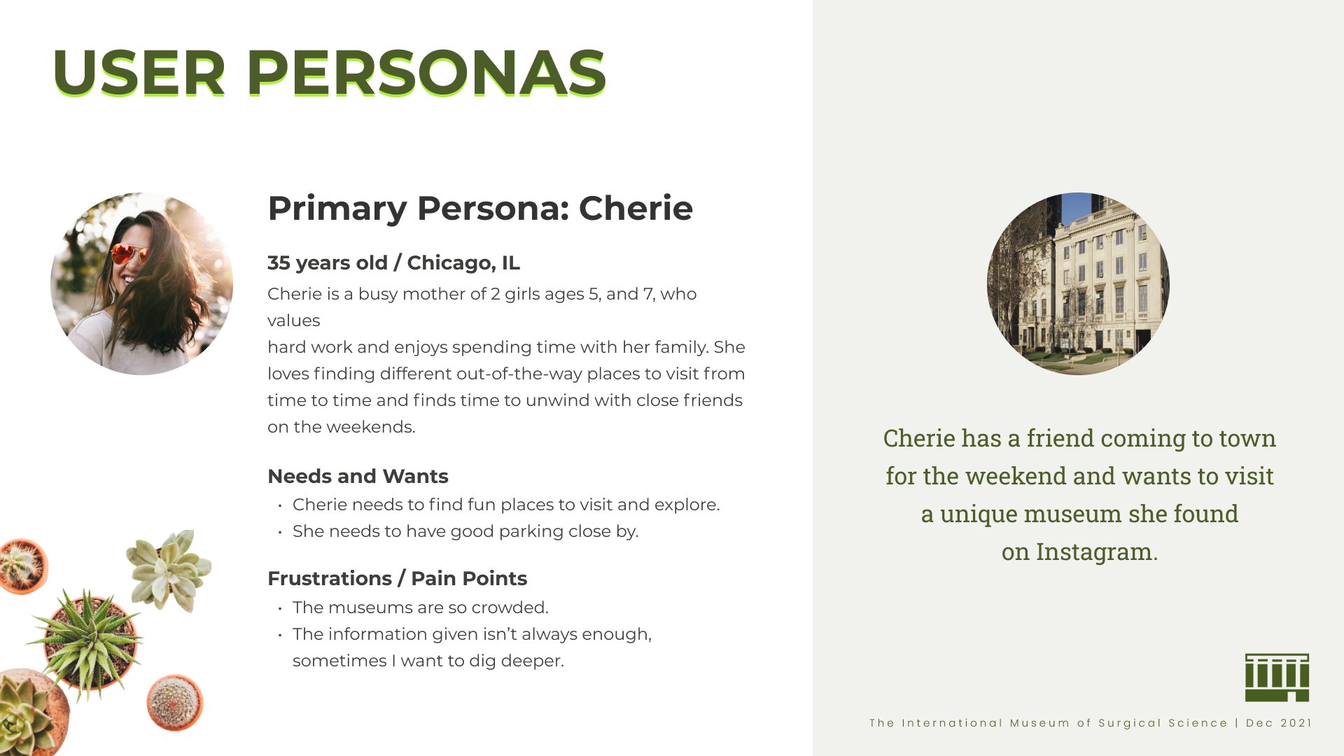
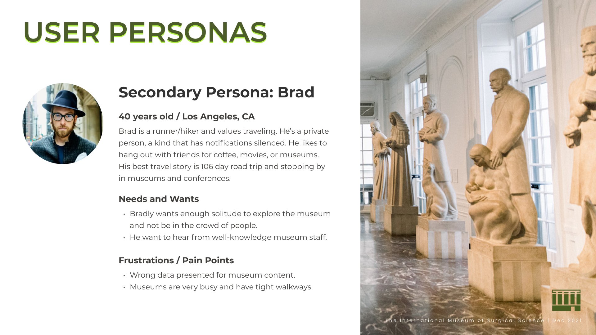
Split by the demographic groups of survey takers and the user interview conducted, we developed the following personas for potential app users (if they had known it existed).
Part 1: Create an Engaging Experience for a General Audience
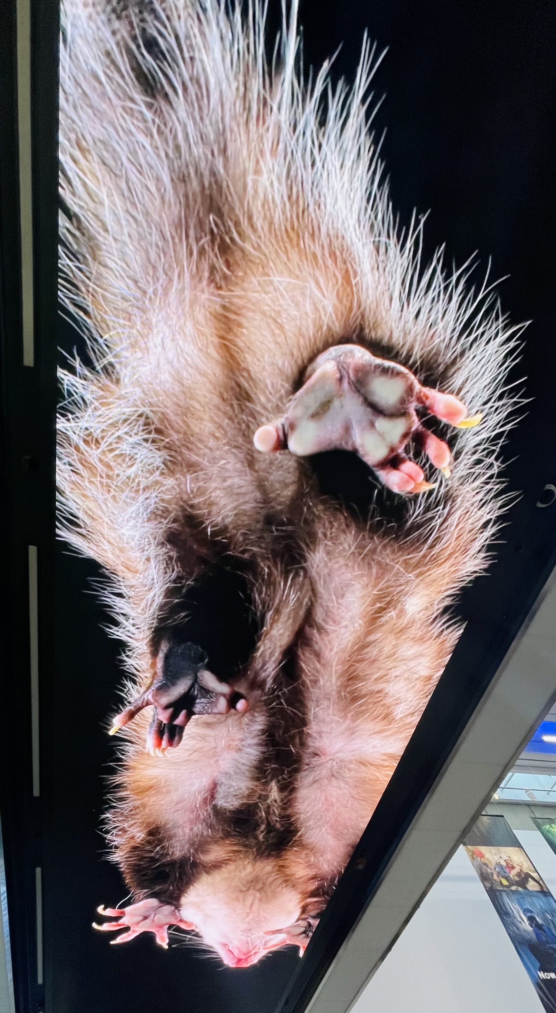
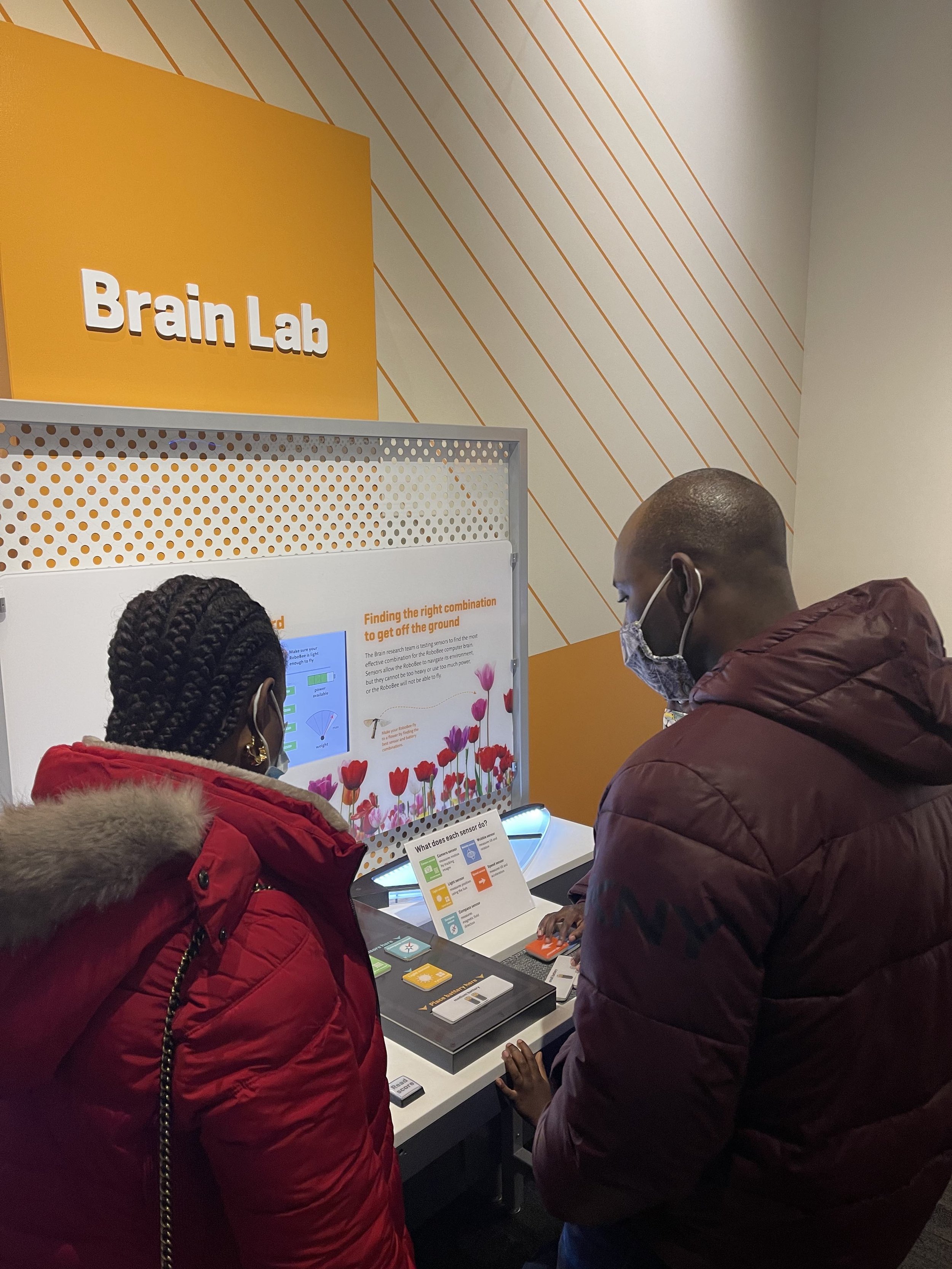
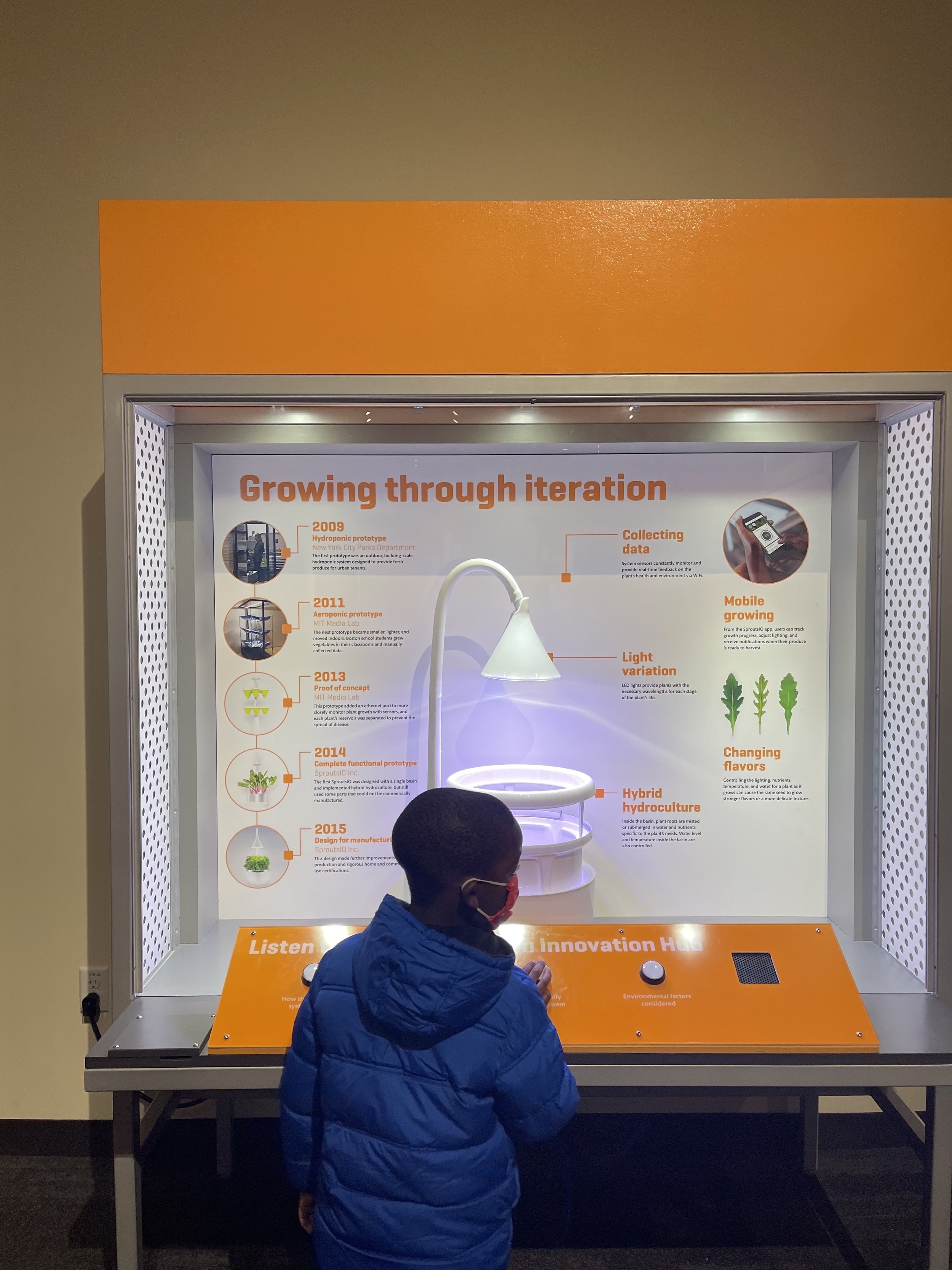
I visited the Museum of Science in Boston to gather ideas on how to make science accessible to non-scientists and children. I participated in interactive experiences, including one about the factors influencing the age at which people leave home. The graph displayed the age range when individuals moved out, considering factors like gender and household size.
Leveraging survey insights highlighting a strong interest in art and history museums, we developed the PAINTress Your Pain concept. This interactive experience invites visitors to rate their most recent pain on a scale of 1-5 by selecting a painting that reflects that severity, such as choosing a piece that represents a level of 5.
Visitors can then compare their ratings with others, fostering a shared narrative about the subjectivity of pain.
Left: Data Visualization by Museum of Science, Boston | Right: Data Visualization by our App.
Part 2: Real-World Application
Expanding the Concept Beyond the Museum
Through my design process, I realized that PAINTress Your Pain has potential applications beyond the museum space. The data collected from this interactive exhibit can also be a valuable tool in pain management clinics, where patients often struggle to accurately describe their pain.
Personal Insight
During a visit to my dad’s pain management clinic, I observed how he would initiate conversations with patients to gauge their pain severity. However, words often fell short in describing the full scope of their experiences. The ability to express pain intensity more intuitively could help patients communicate more effectively with healthcare providers. This led me to realize that the PAINTress concept could be a powerful additional tool, offering a visual and emotional medium for patients to describe their pain severity.
The name PAINTress itself reflects this duality—paint + express—capturing the blend of art and communication through painting.
Next, we created our mood board by looking at direct and indirect competitors. We collected medical and art history images and defined the app's design style and mood.
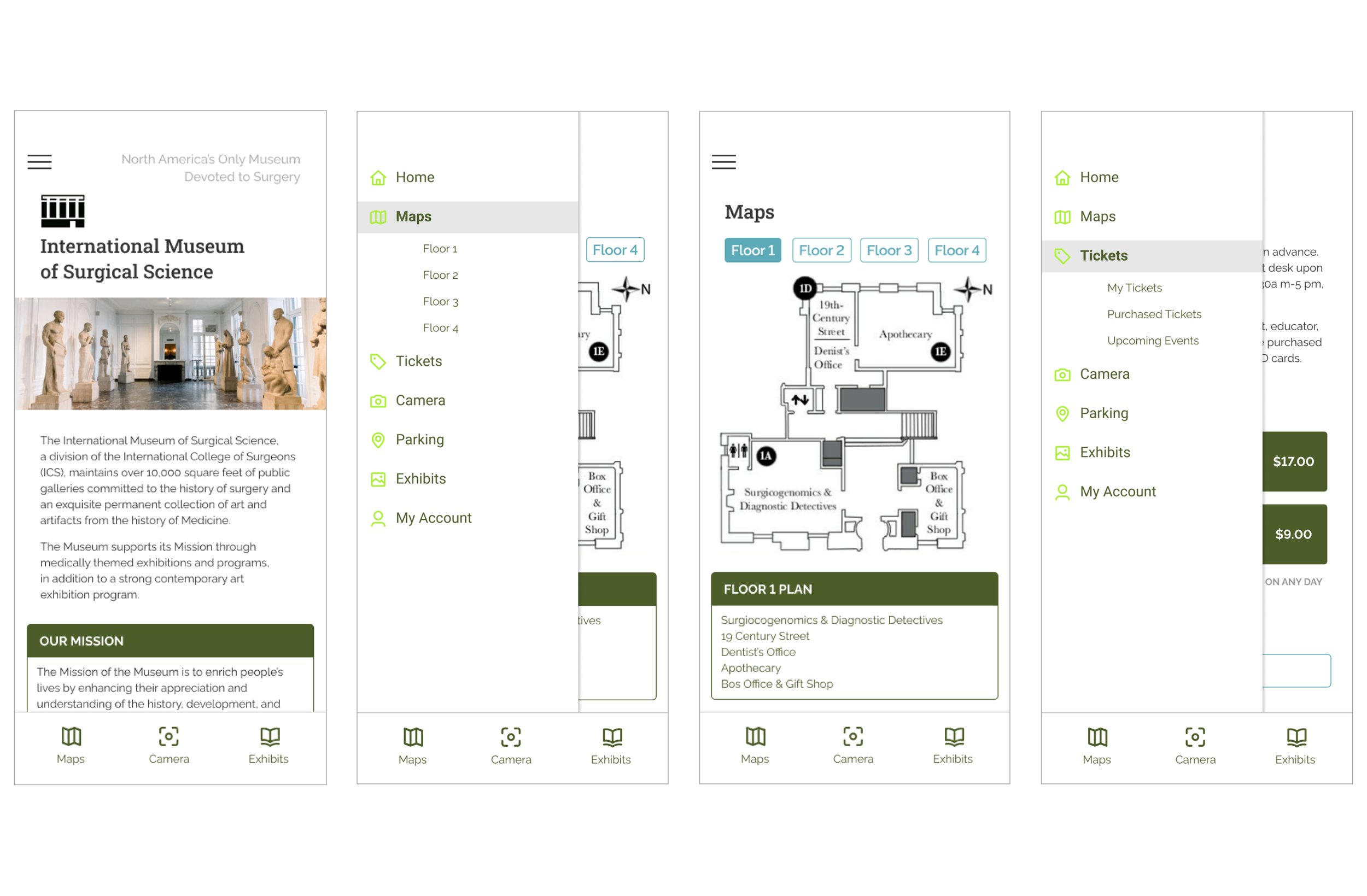
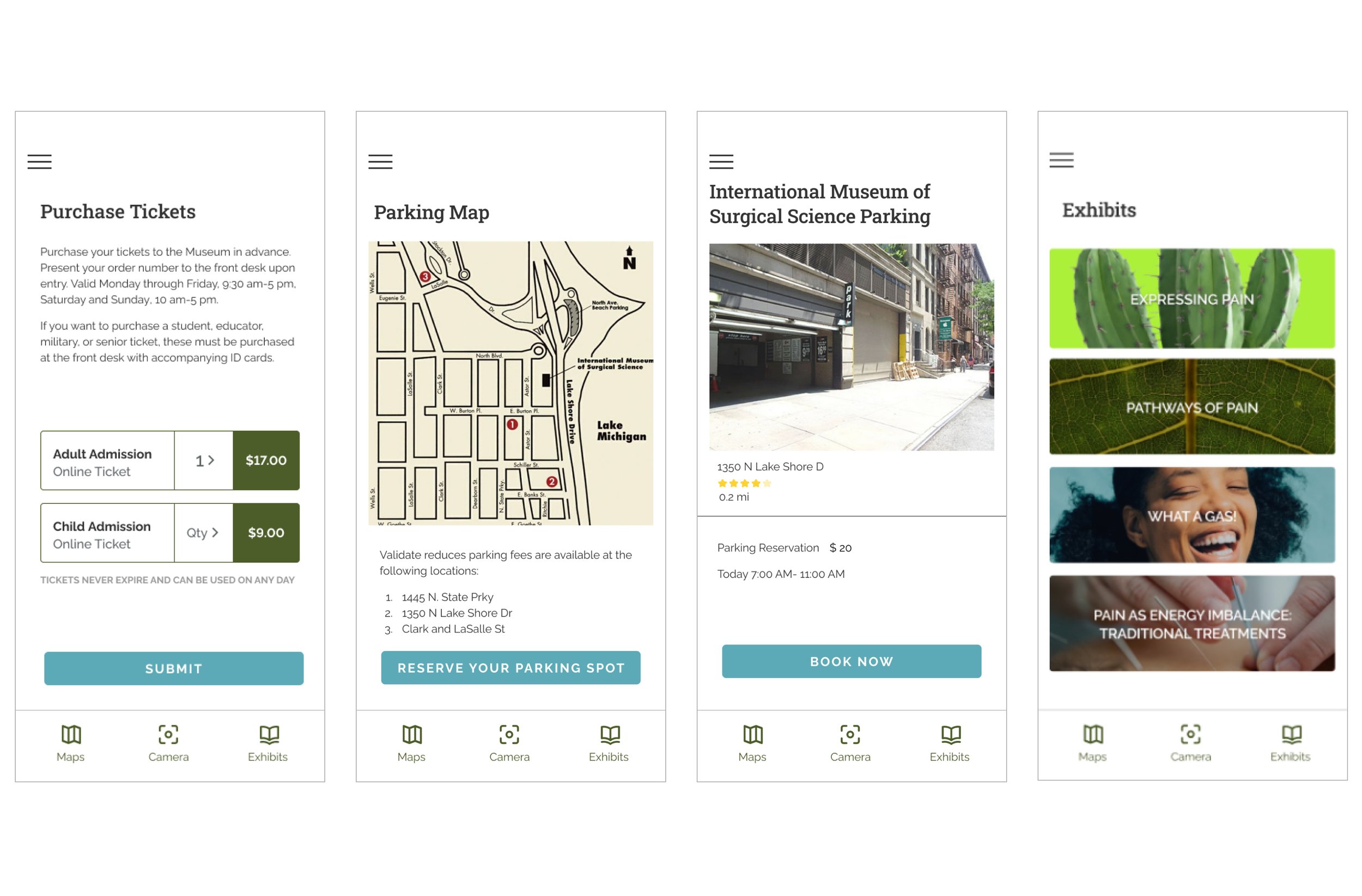
We focused on designing certain pages of the museum that is showing in the site map below.
Cherie, our primary persona, enters the app and follows the path outlined in our user flow.
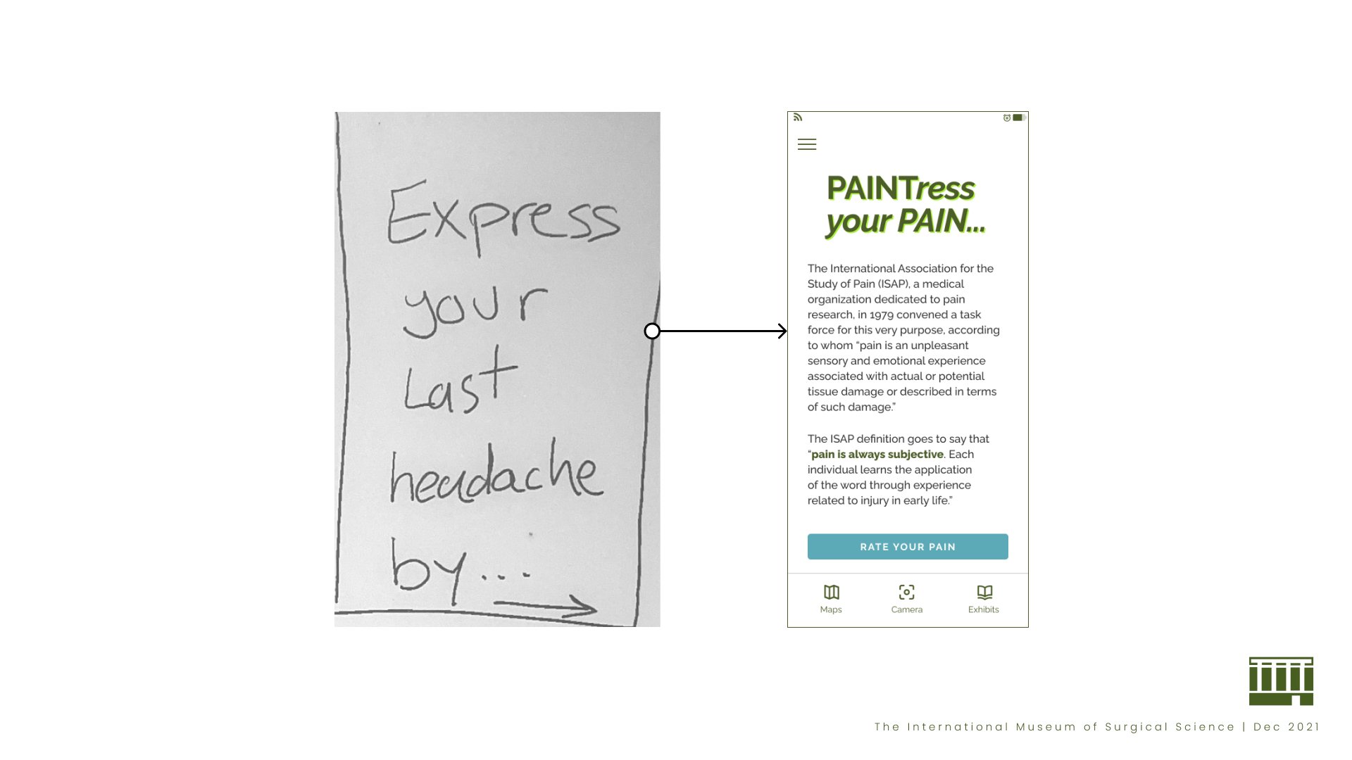
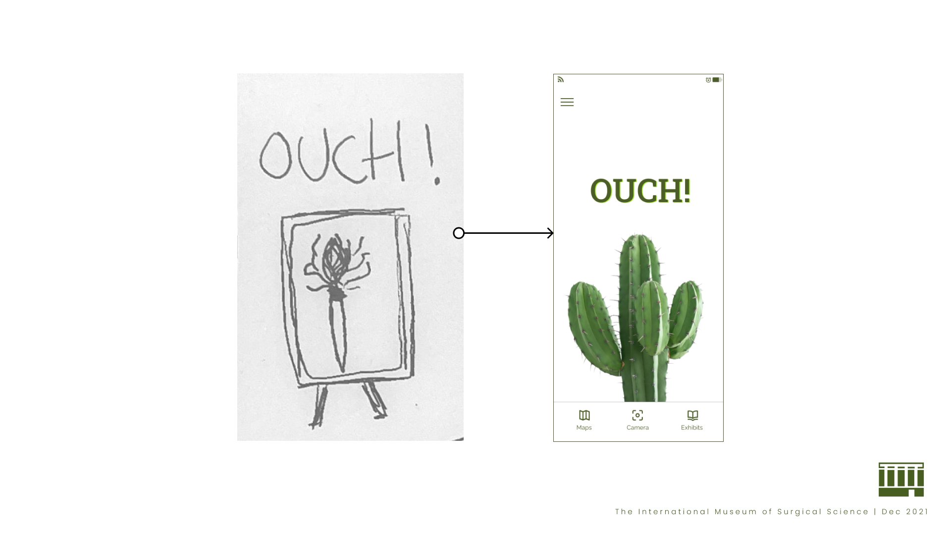
IDEATION — Sketches
VALIDATE
Usability Testing
Usability Results
TASK 1: Locate the “Pathway of Pain” exhibit.
Version 1: 83% success | Version 2: 90% success
TASK 2: Locate the “Express Pain” exhibit
and play the “PAINTress your pain” activity.
Version 1: 83.3% success | Version 2: 91.7% success
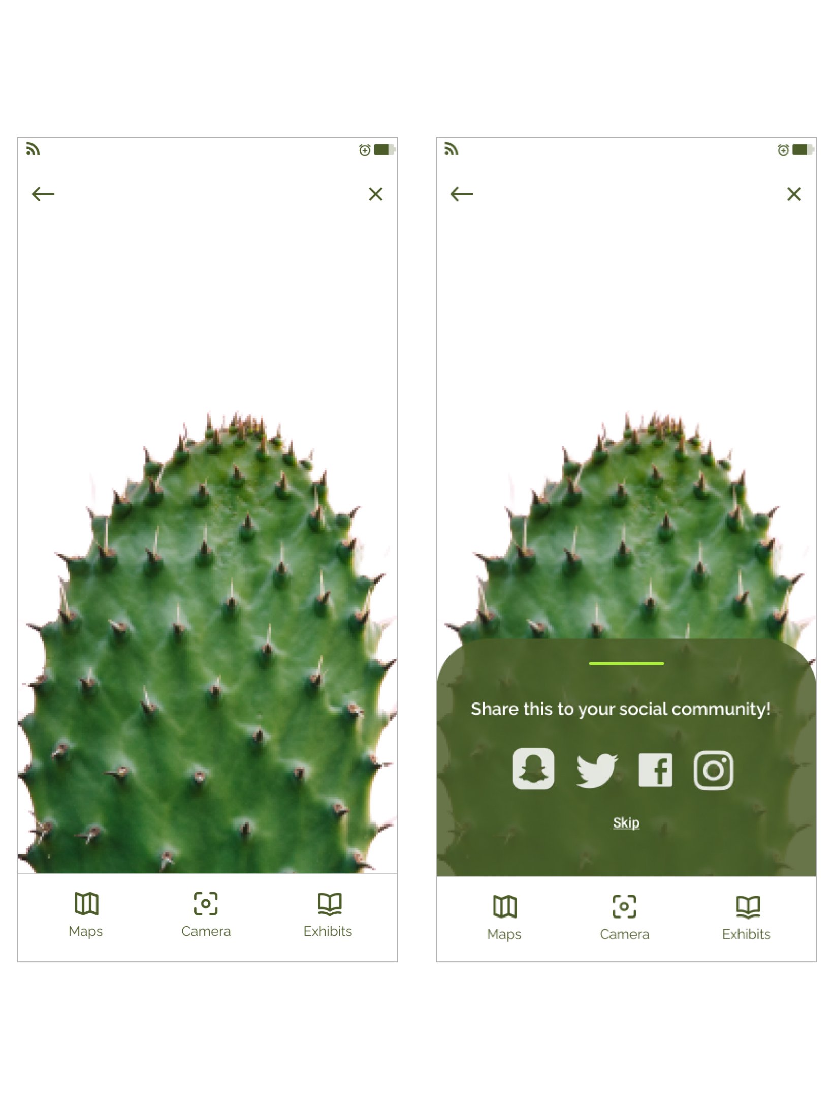
Based on the feedback collected, most testers wanted to see an introduction about “PAINtress your PAIN” before playing. We explained the experience, which could be skipped and continued.
Conclusion
Through the development of PAINTress Your Pain, we not only met the original goal of creating an engaging and educational museum exhibit but also discovered an additional use for the concept. The exhibit's interactive, visual approach to expressing pain can be applied to real-world pain management settings, giving healthcare professionals a new tool to understand patients’ experiences more deeply.


