Behman E-commerce:
UX Case study
MY ROLE: Lead UI Designer & UX Researcher | TOOLS: Figma, Adobe Photoshop | TIMELINE: 2 Weeks
INTRODUCTION
About Behman
Behman loves plywood and believes in making functional and beautiful products that accentuate human well-being. They admire good steady joints. Behman believes construction should be honest and straightforward. They tinker, they improve, and they consider every detail.
They are Behman Design. They are here to make dreams come true in your favorite spot at home in only a few clicks and phone calls.
About Founder
Fater Saadat Niaki is the chief of product design and development at Behman Design Furniture and Home Decor Company.
“The golden rule throughout my career was to think about possibilities, understand what and how it could be improved, endeavor to make it happen!”
Client Need
Behman Design - A Tehran-based furniture studio - needs an e-commerce website to appeal to a broader market and increase sales internationally.
UX RESEARCH
and ANALYSIS
Since Behman is a premium brand and the users spend a hefty amount to buy furniture, it was difficult to establish the same trust online. After talking to some regular and new customers of Behman, a few common themes of user ‘fears and motivations’ emerged:
What is the primary concern about buying furniture online?
Critical Business Challenge:
The key challenge faced in the initial phase was to set the right balance between the user’s expectations and the owner’s vision. Our primary research made it clear that people weren’t favoring an e-commerce platform for a unique furniture store — but COVID-19 was obstructing the sales otherwise. We, therefore, knew that we had to develop a step-by-step process to shift the consumer trust online entirely, which can only come with time and a robust digital marketing strategy.
How Might We
• Bring the cost down?
• Help customers have an easy assembly experience?
• Collect space measurements and offer products
accordingly?
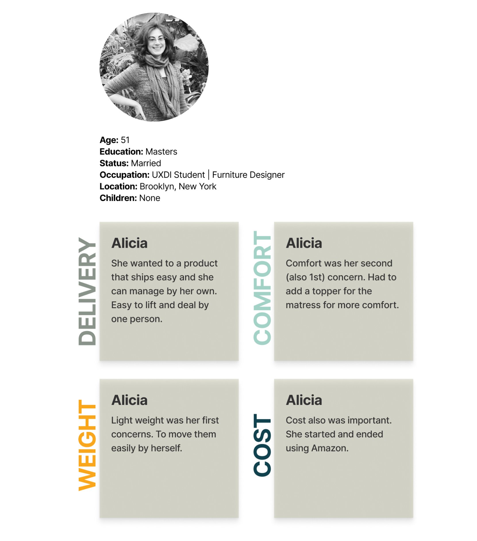
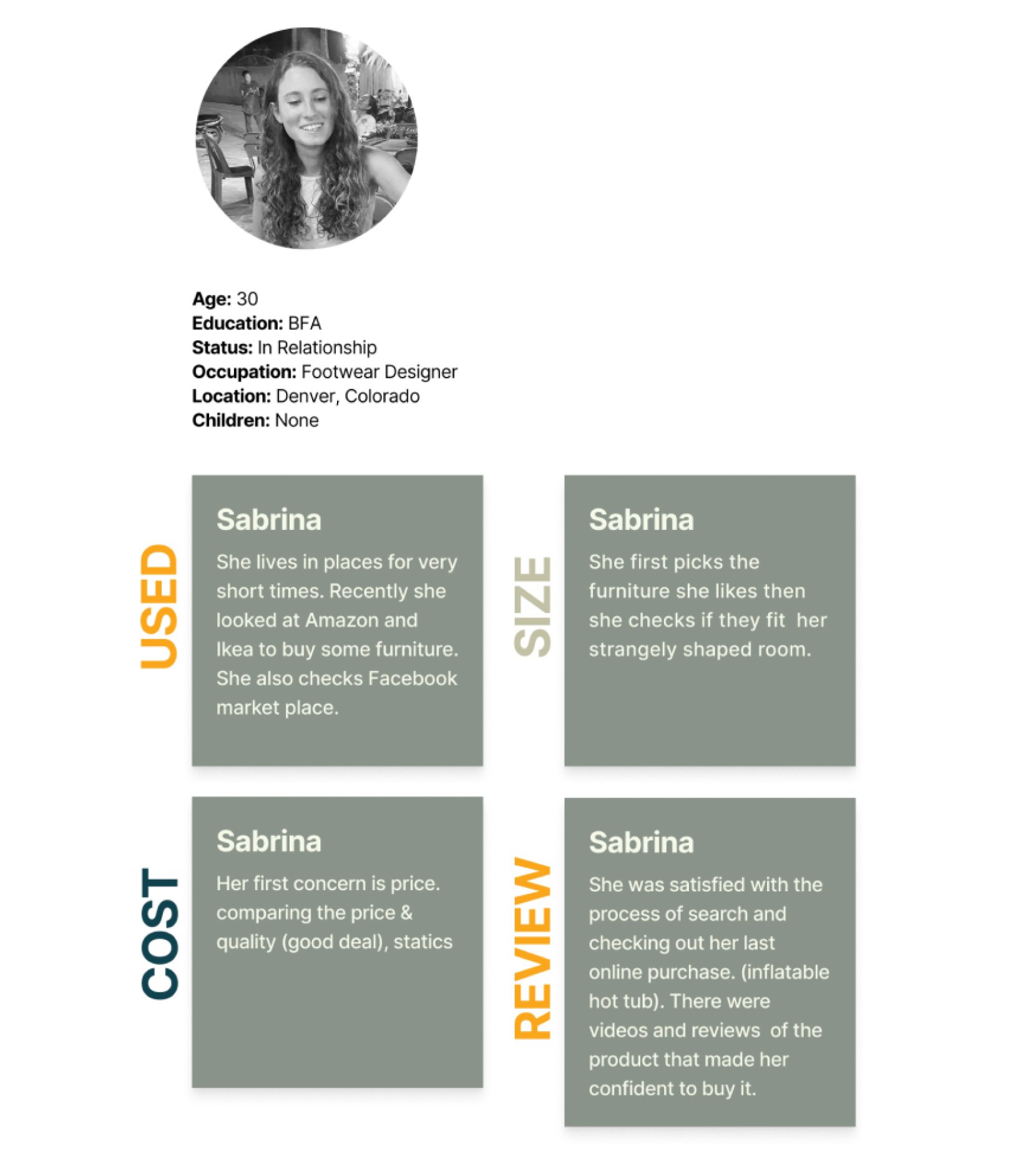
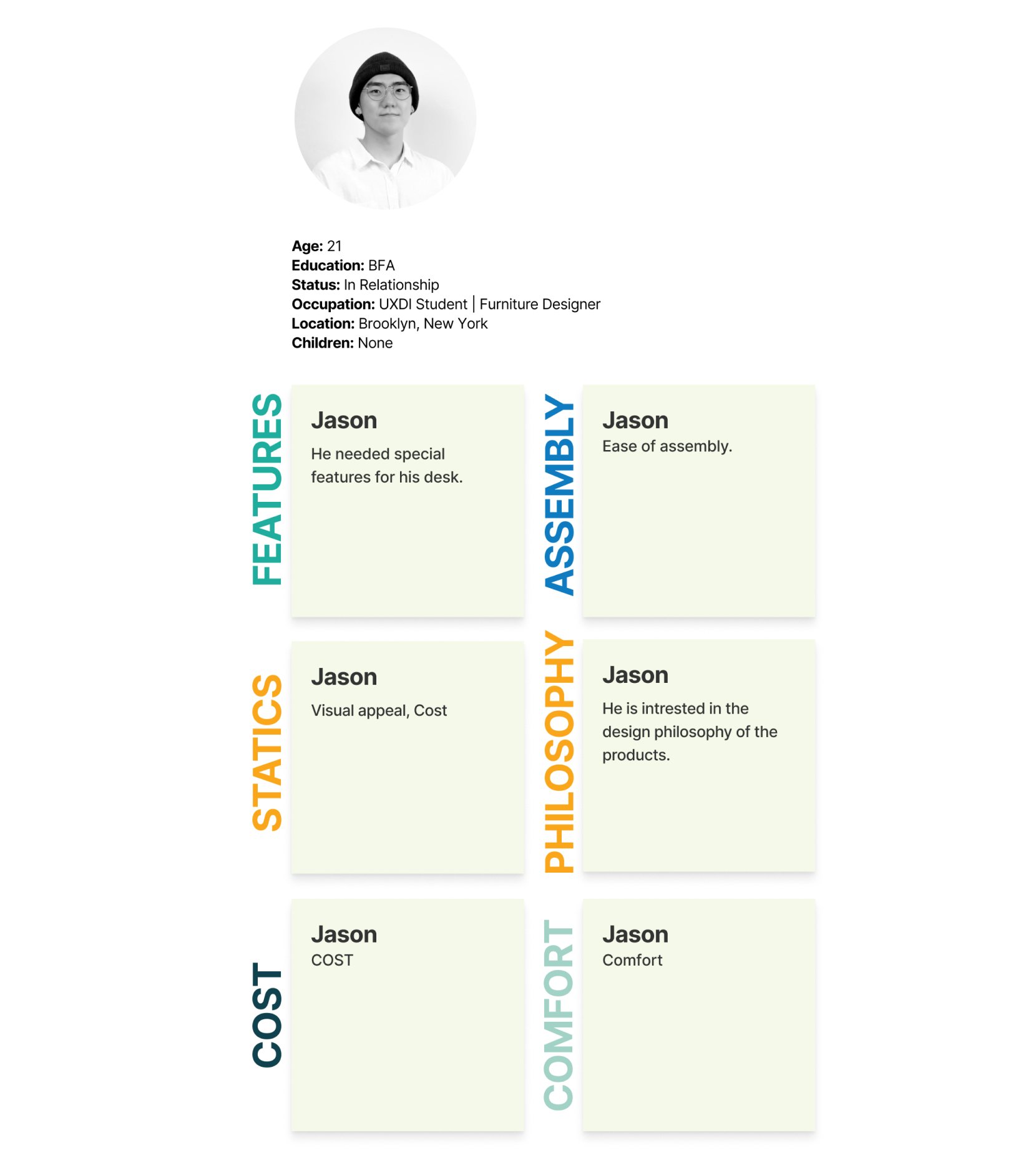
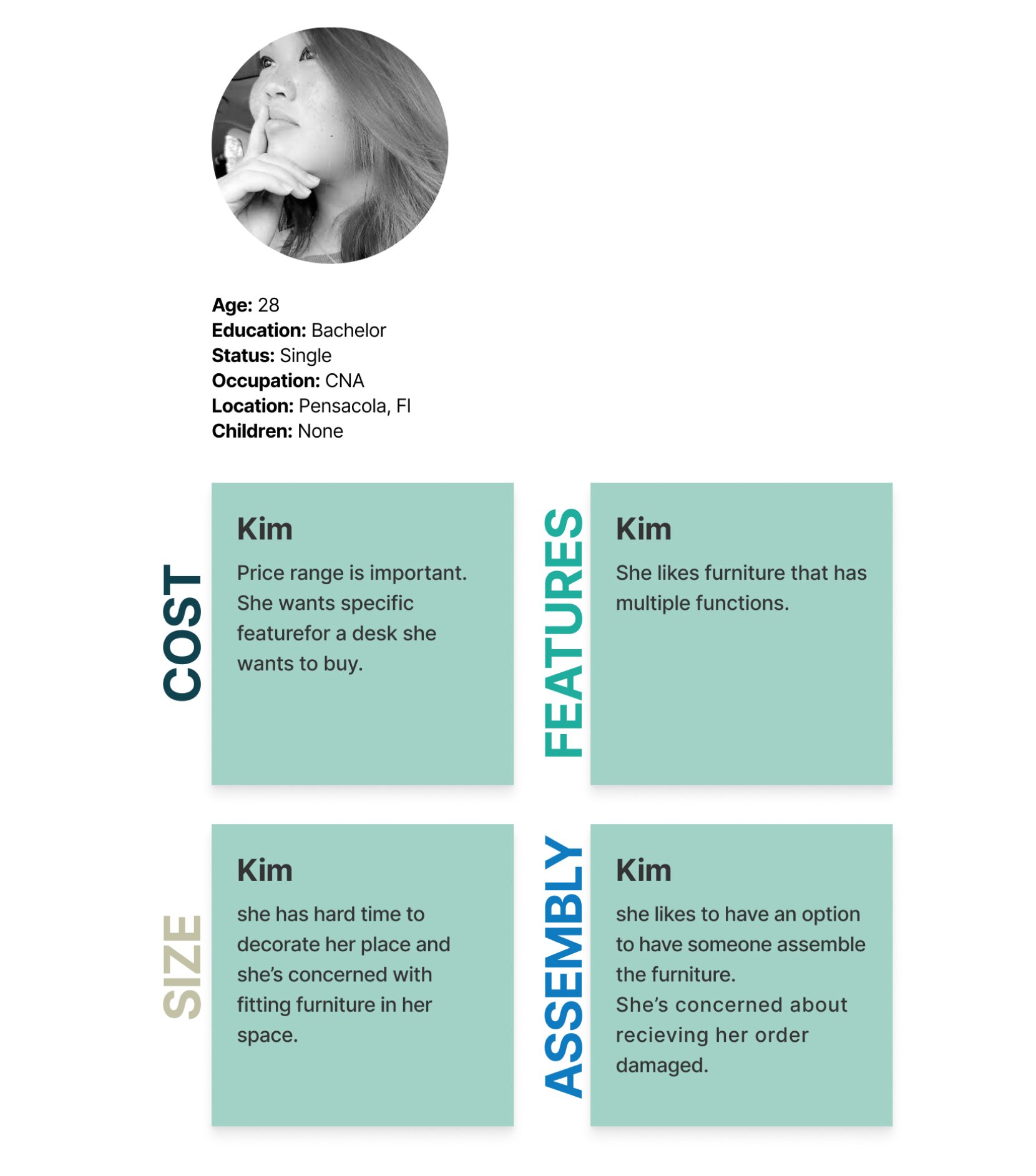
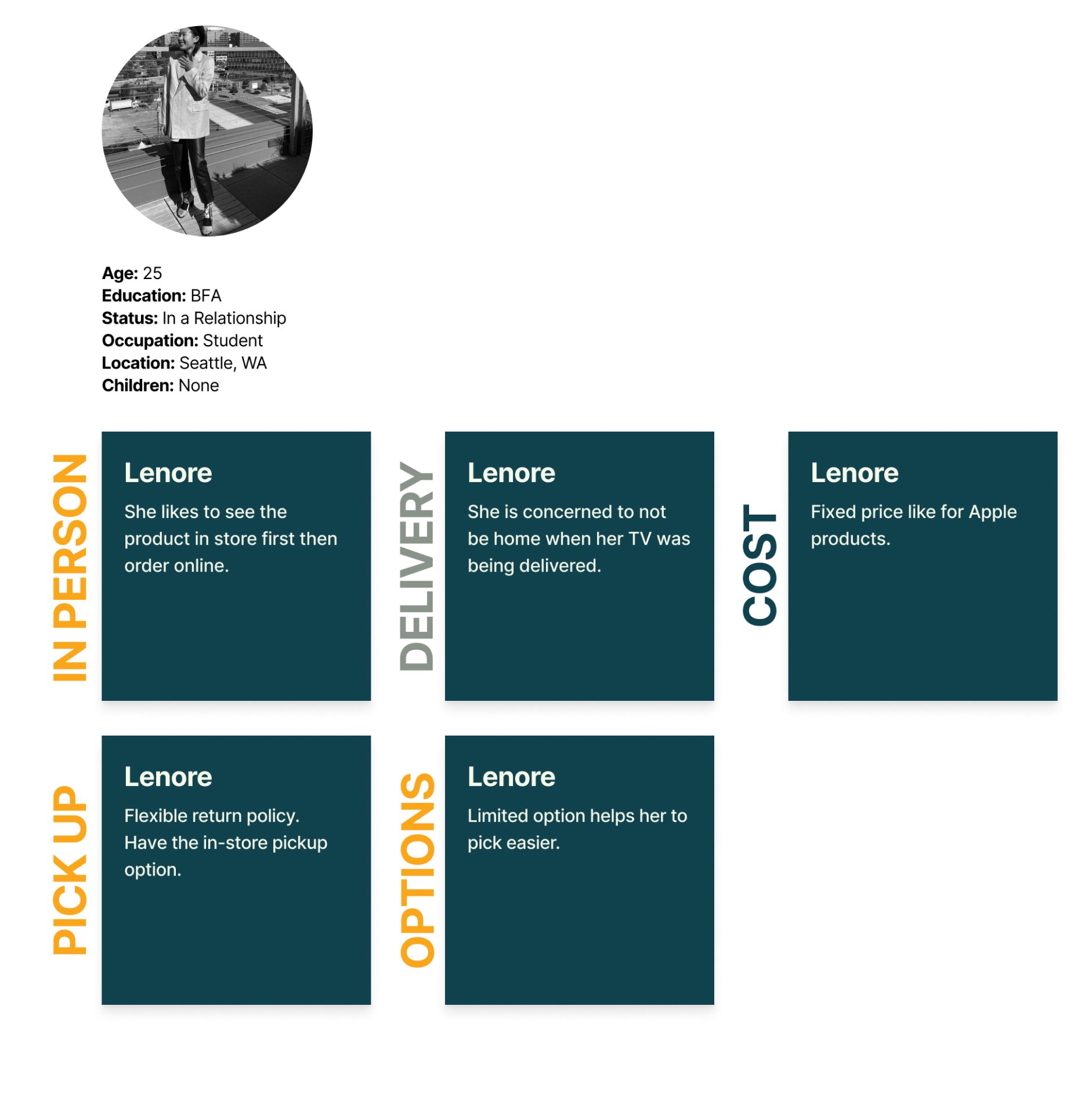
PERSONA
Who am I designing for?
USER FLOW
OPEN & CLOSE
CARD SORTING
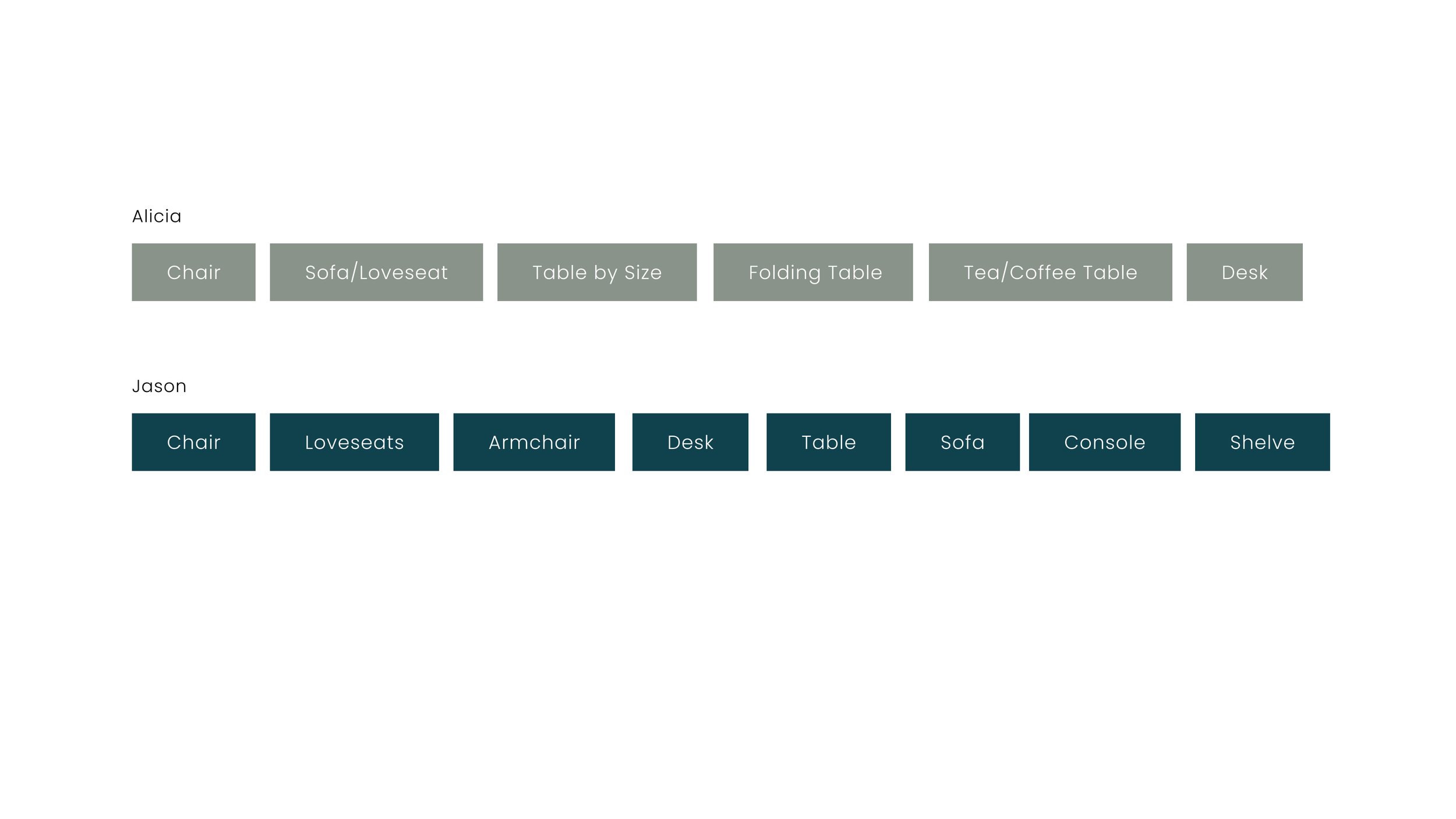
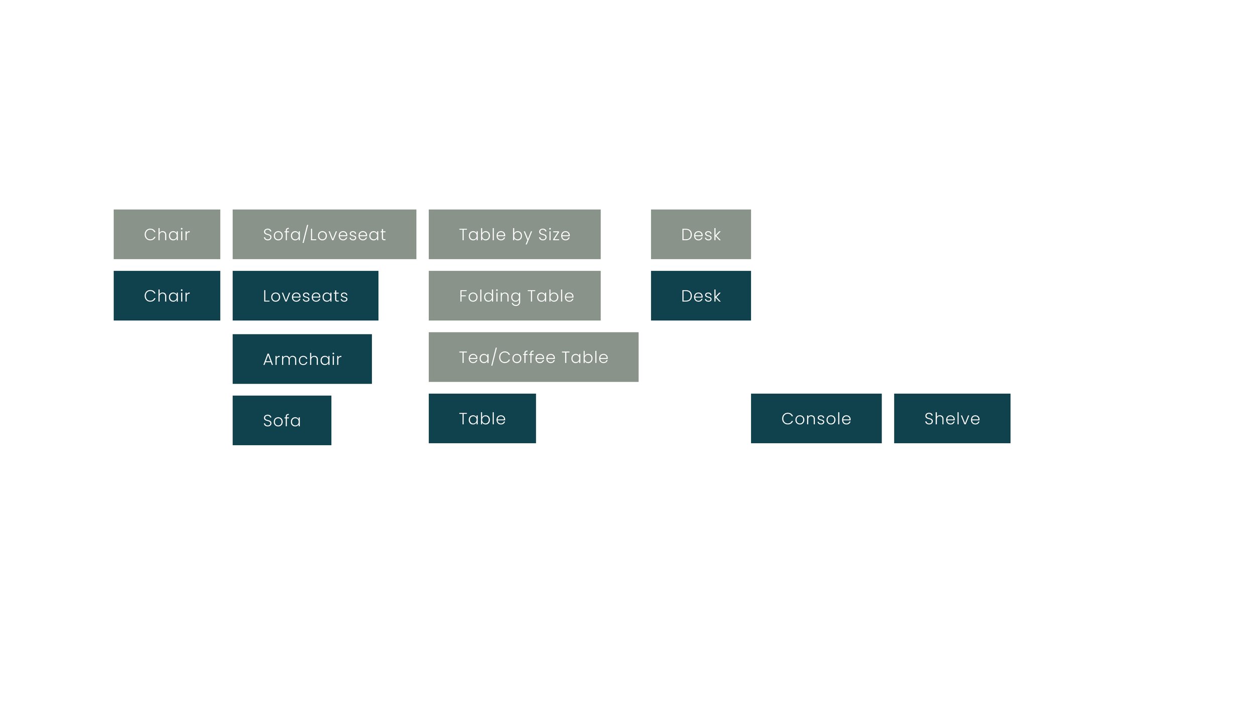
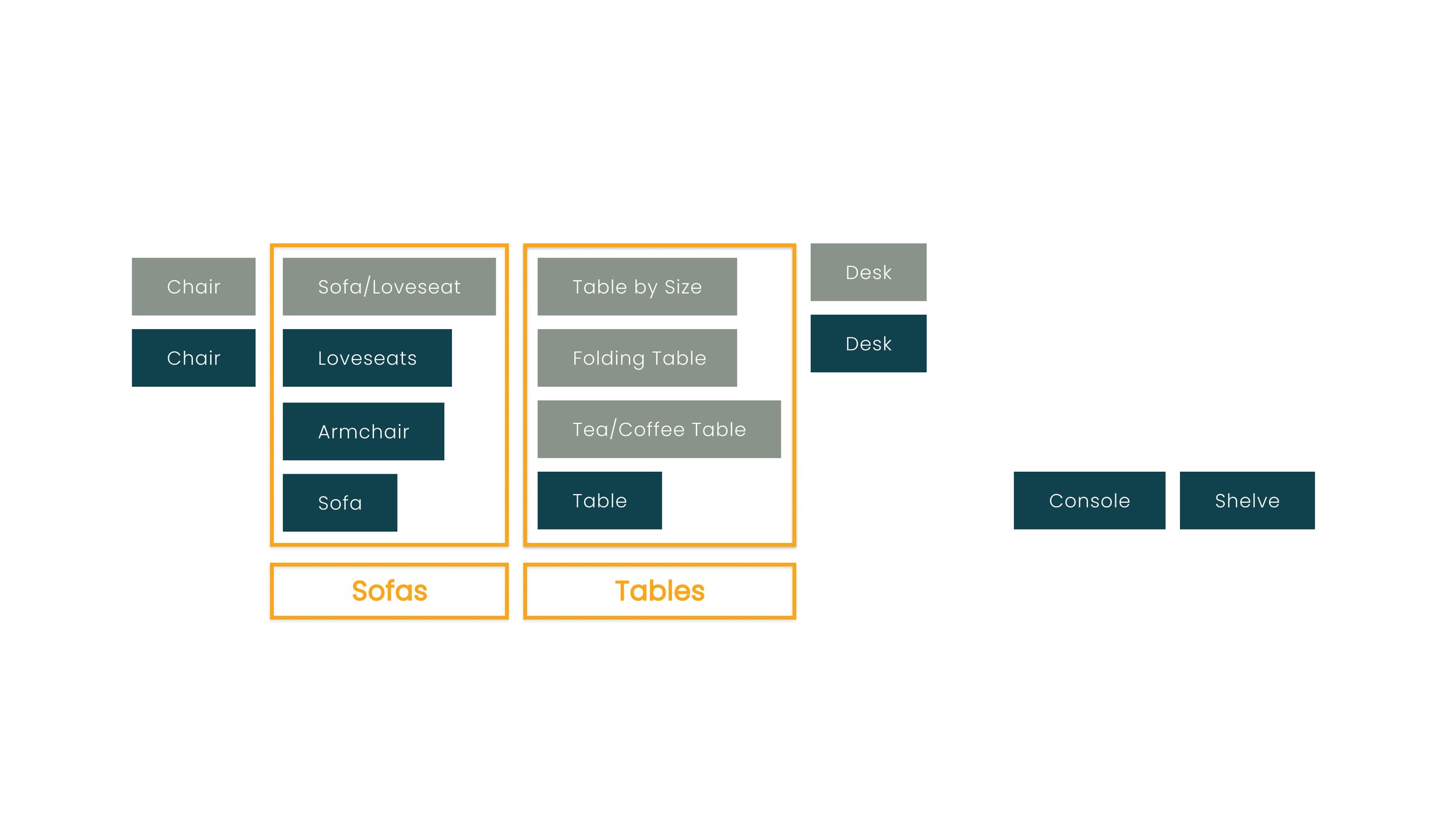
Behman Design's product inventory was huge. I conducted four open carts sorting to uncover users' "Mental Model" for better product architecture on the website.
Close card sorting insights
IDEATION
and MOODBOARD
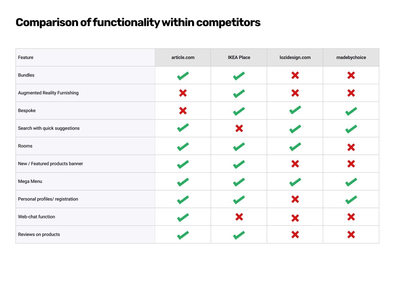
After studying the competitors and exploring similar websites, I generated the color palette and mood board.
PRODUCT CARDS
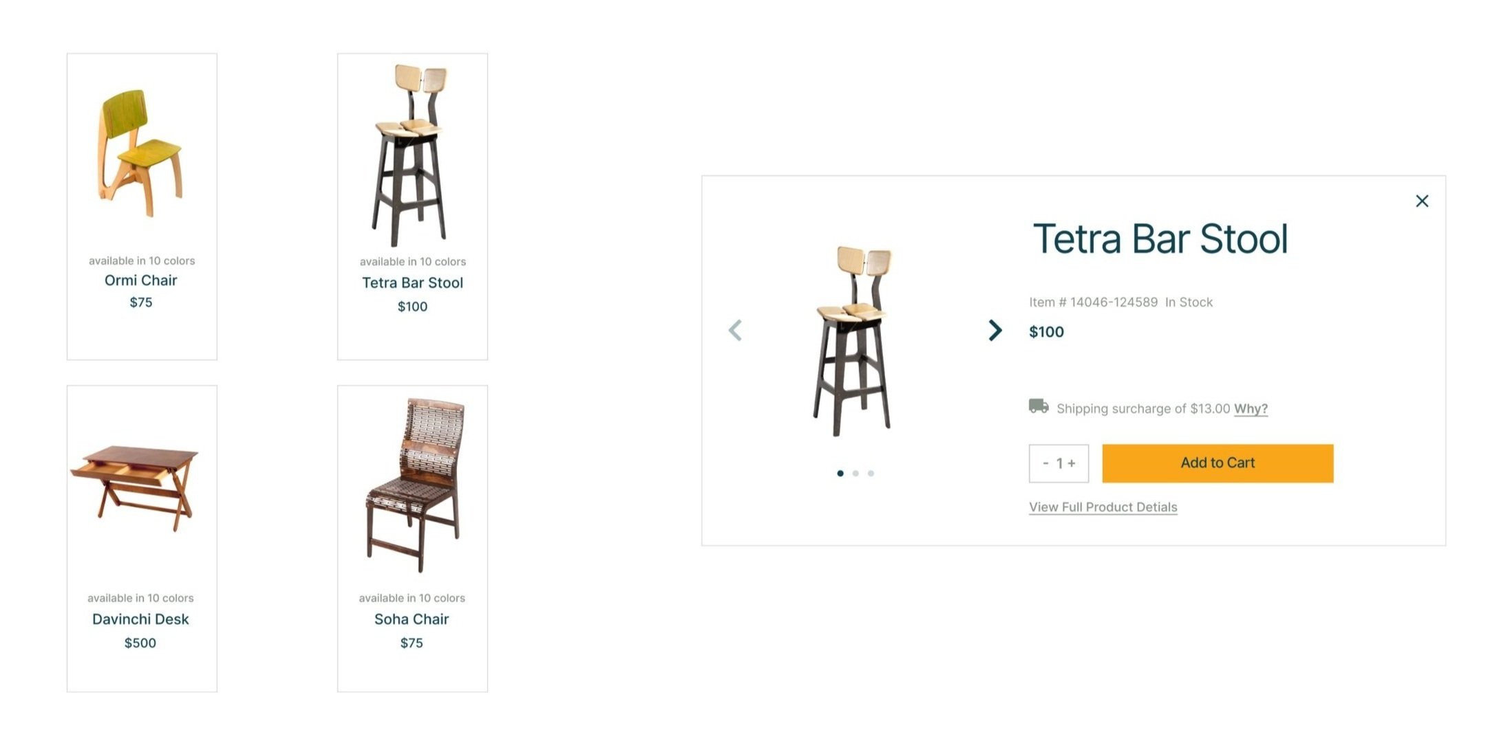
Behman studio provided me with high-resolution photos of their products. The product cards give website visitors an indelible impression of a website and hence the trust to add the product to the shopping bag.
USABAILITY TESTING
Testing: V1
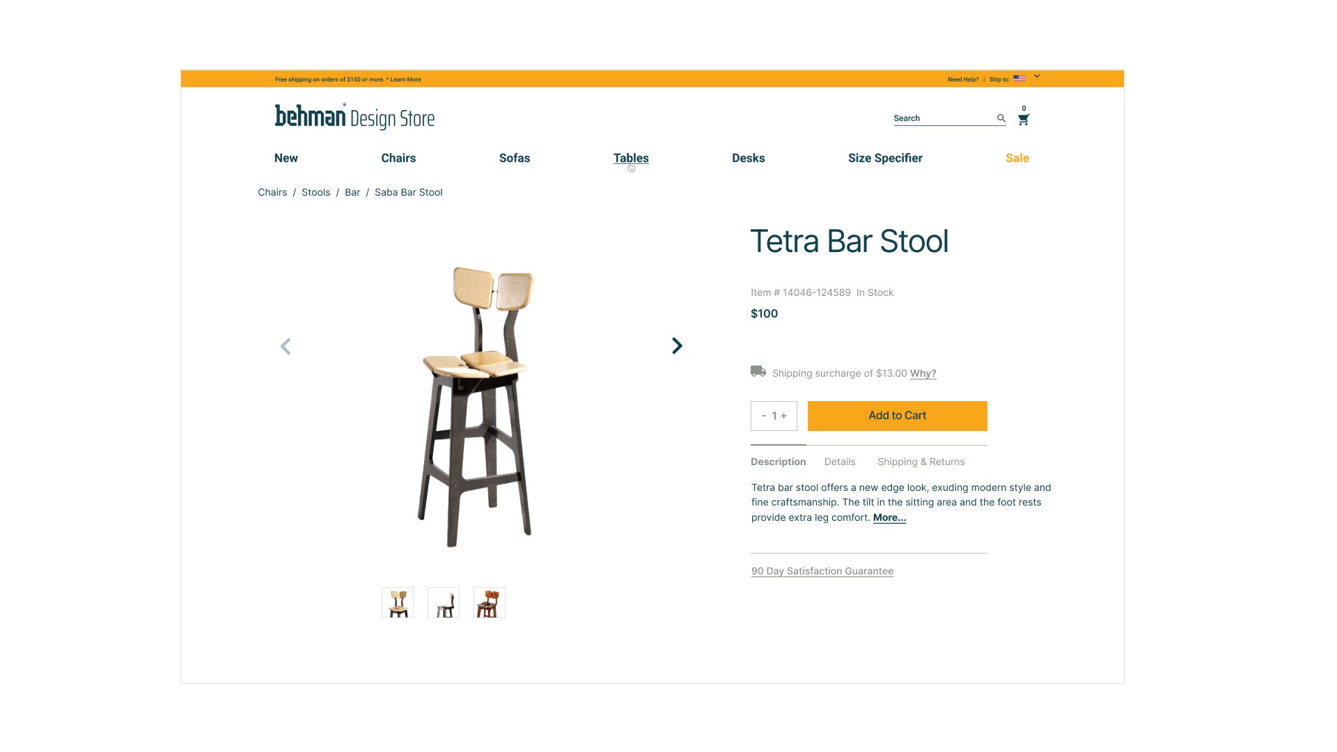
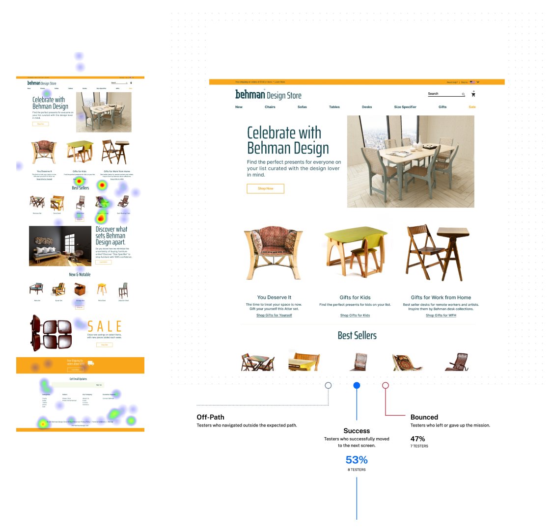
Mission: Under “You Deserve It,” Add the “Tetra Bar Stool” to your Shopping Cart.
Success: 53%
Key Finding: “You Deserve It” is a unique collection name. For first-time users, finding it on the homepage was challenging. I picked a more general path with more familiar terms for the second test. [Below are the results of my second testing]
Testing: V2
Mission: Under the “Gifts” tab, Add the “Tetra Bar Stool” to your Shopping Card.
Success: 86%
Through this usability test, I saw many miss-clicks; first, they seemed random, but looking closely at the click spots, I noticed one product was getting all the attention. This specific product, Khayyam Lounge, was not mentioned in the mission description on the Maze website and was not prototyped. It seemed like the tester’s eyes were attracted by this product more than anything else. I shared my observation about the popularity of Khayyam Lounge throughout the testing with the business owner. I suggested they feature this product on their other print and digital marketing materials.
Key takeaway: Honing your eye for observing and analyzing the overall interaction of users with elements around them opens up ways to develop unexpected and new opportunities.


