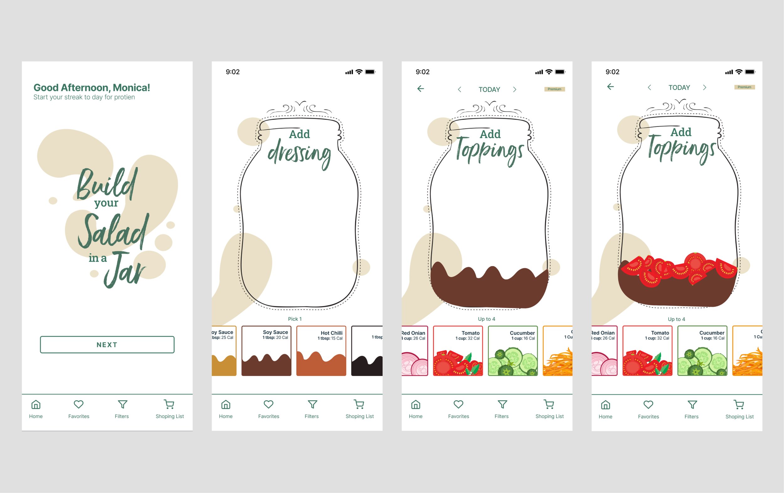
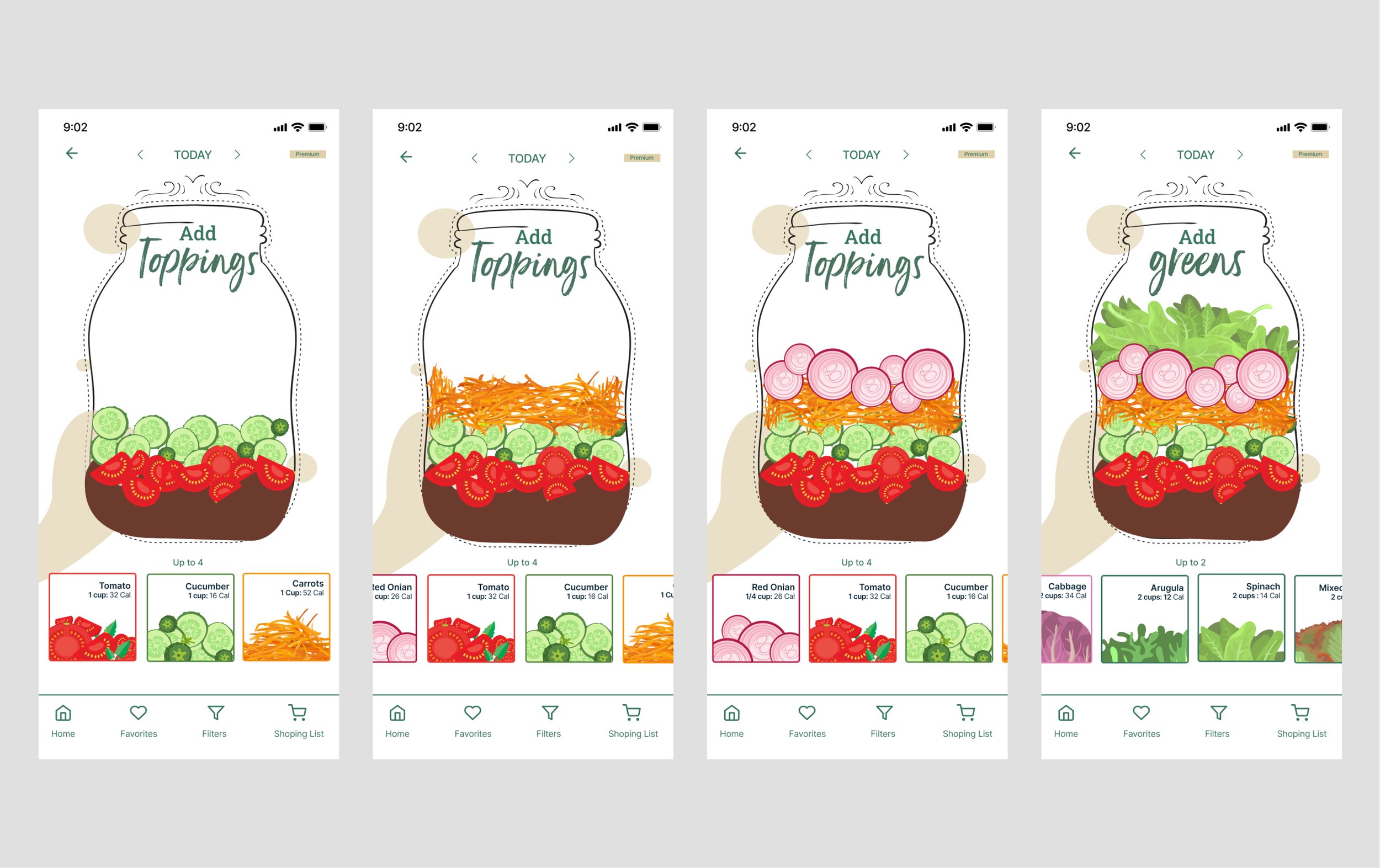
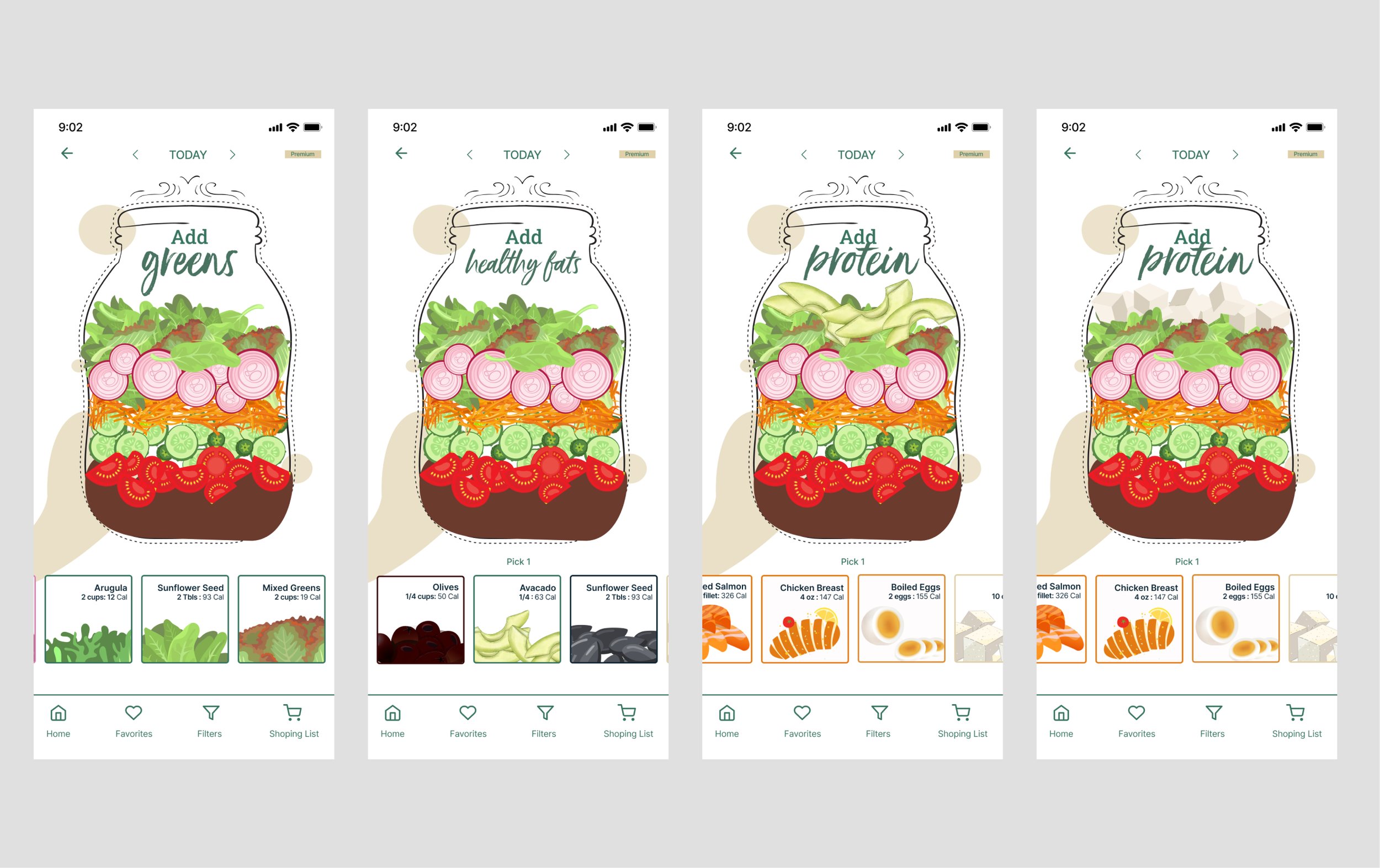
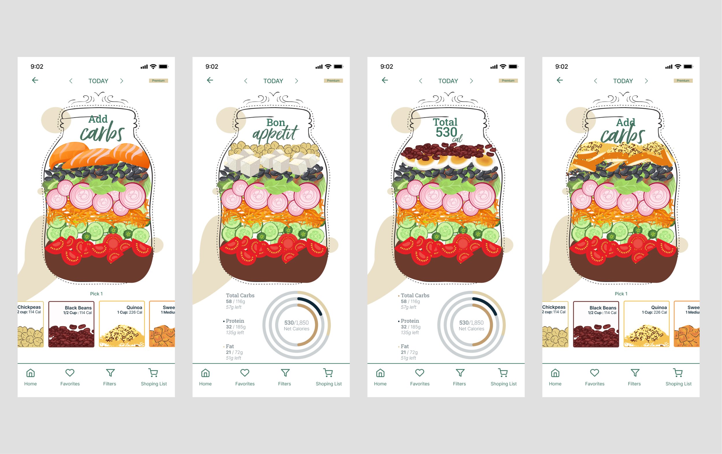
SALAD in a JAR App:
UX Case Study
MY ROLE: Lead UI Designer & UX Researcher | TOOLS: Figma, Adobe Photoshop, Adobe Illustrator | TIMELINE: 2 Weeks
INTRODUCTION:
Why SALAD in a JAR?
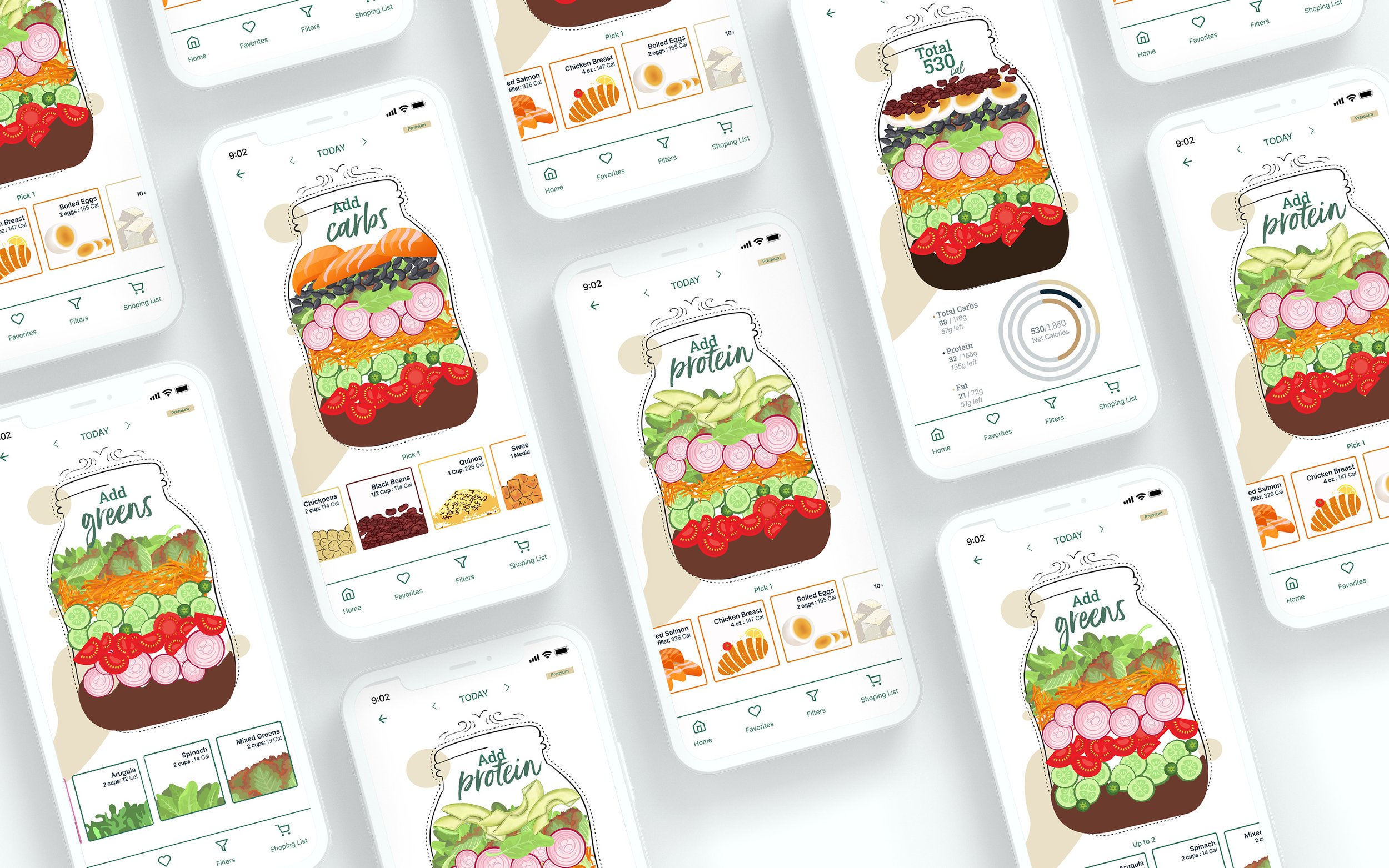
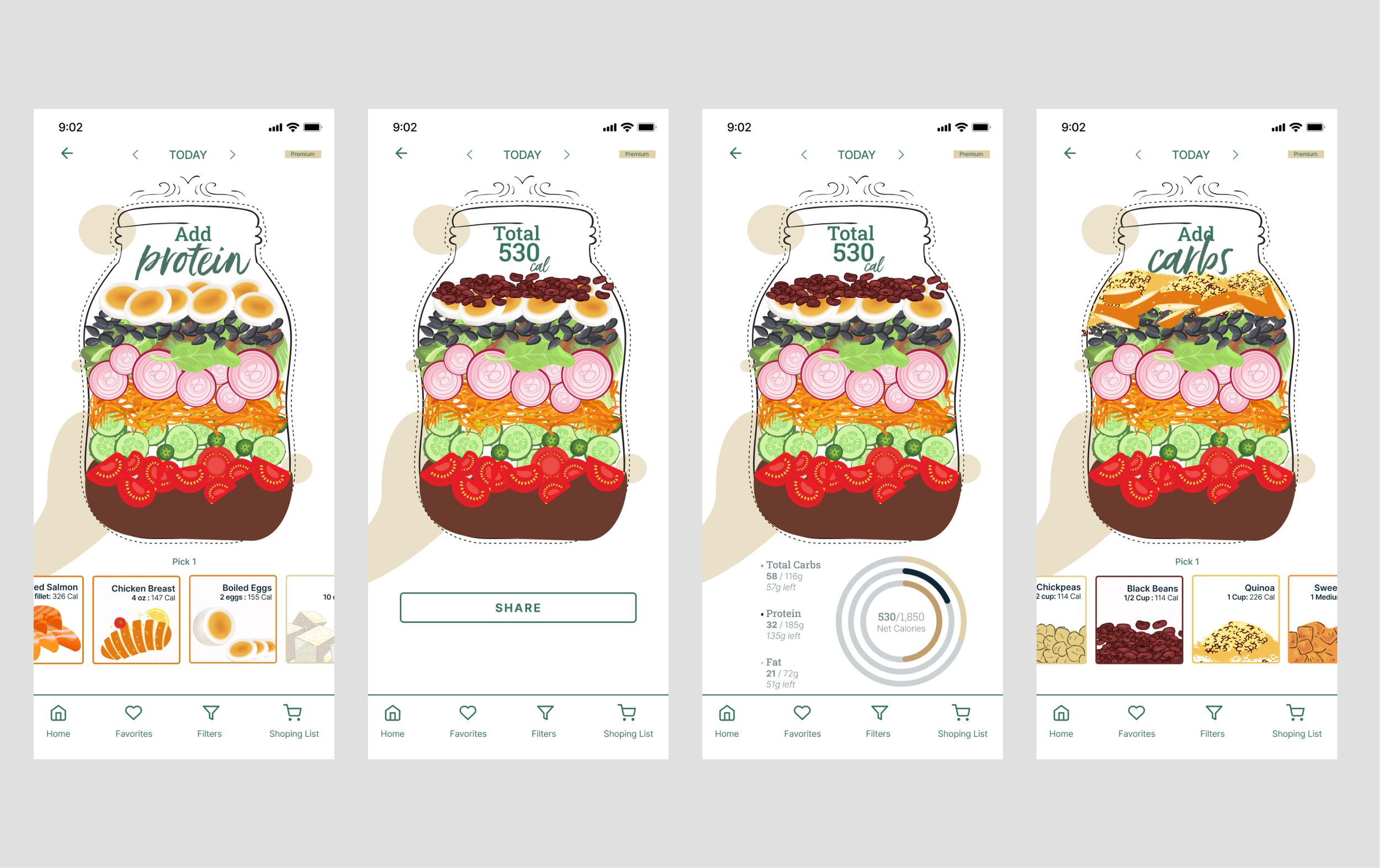
SALAD in a JAR is an app that guides users in creating salad meals
using a portable, storable, and innovative method.
"Amber Heard once said, 'You feel better when you're eating food that retains nutritional value.'
When I began my first full-time office job, one of my primary lifestyle challenges was finding healthy lunch options. Wanting to maintain nutritious eating habits without breaking the bank on daily takeout, I sought a reliable, portable solution to meet my nutritional goals.
That's where Salad in a Jar came in — an ingenious app designed to simplify healthy lunches. Recognizing the effectiveness of meal prepping for tracking nutrition intake, I incorporated a feature into the app allowing users to view the nutritional facts of each ingredient as they add it to the jar. Moreover, I devised a method for layering the ingredients within the jars, starting with wet ingredients like dressing or vegetables to prevent wilting or sogginess.
To gather data, I conducted a survey via my Instagram account: @tasteoffitnesss. The survey questions focused on meal prep habits, motivations, and challenges faced during the workweek."
Survey Objectives:
• How much do people know about Jar Salads?
• How do they use salad meals, and what are their preferences?
• What ingredients are the most popular?
• Which meal of the day do they eat/make salads?
SURVEY
Critical Insights from my survey:
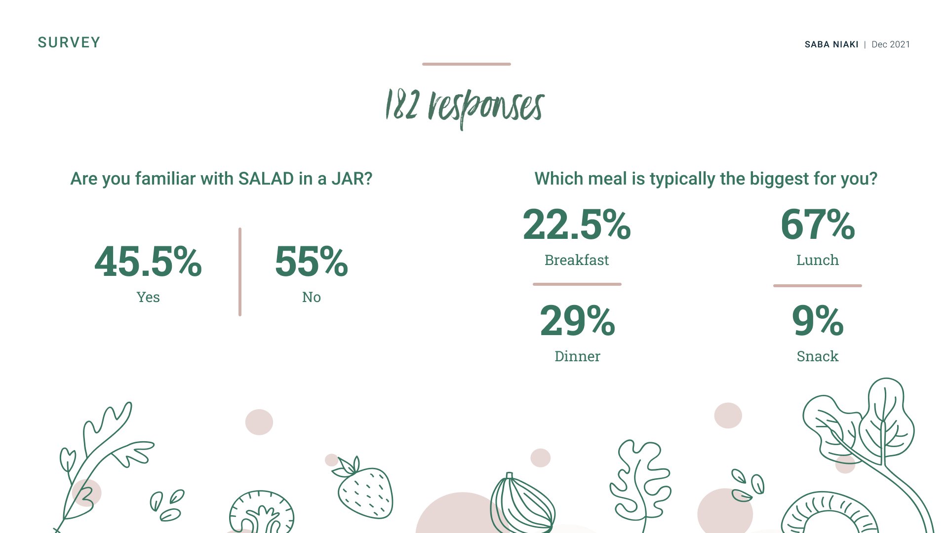
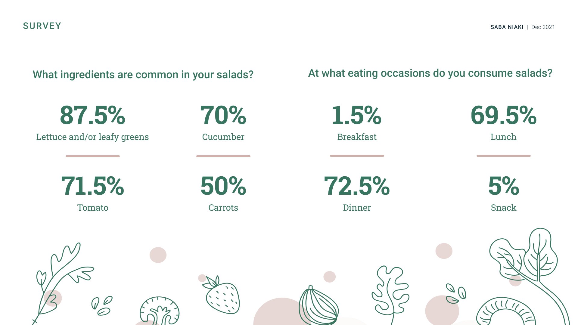
Survey results show the popularity of having salads for lunch and dinner. Sixty-seven percent of survey attendees rated lunch as their biggest meal. Therefore, this application focuses on educating users to build salads that are rich and nutritious enough to be replaced as the main meal.
People want a variety of easy-to-make and follow-along recipes. Some vary the recipes chosen by a theme or based on the main protein.
People have many methods of searching for recipes, and they are in multiple places, so they do have a “saved” recipe folder. Google was the most popular option for people who ate meat, but non-meat individuals referenced Pinterest and previously found blogs.
People select recipes based on several factors: what they already have, what produce is in season, how long prep time is and cooking around their schedule, how many stores they would need to go to, and current sales.
COMPETETIVE ANALYSIS
To better understand the way meal-prepping works, I looked at a few mobile app competitors to see what the market looks like; What is working well, and what is missing. (i.e., if all of the competitors are offering specific functionality, users will likely expect your product to provide similar functionality)
Results of Competitive Analysis
EMPATHIZE
Provisional Persona
Based on my survey and competitive analysis findings, I felt confident in moving to the next step of designing my product, which was coming up with a strategic plan and helping build competitive advantage into my product.
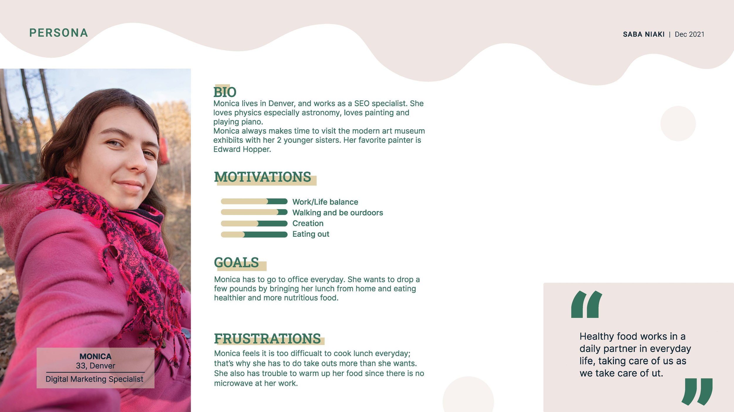
To start, I created a provisional persona of a potential user for the meal planning app based on my understanding of how I use other meal planning apps.
IDEATE
VALIDIATE
Usability Testing
I tested my prototype using Maze on five people to validate my proposed design solutions. Through testing, I discovered some hesitation and incorrect actions in picking and dragging the ingredients; the reason was that I did not prototype all the components for this scope of my project. I modified the task description, and instead of letting them choose any ingredient, I asked them to add a specific one. As a result, the misclick rate dropped significantly.

